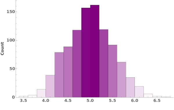
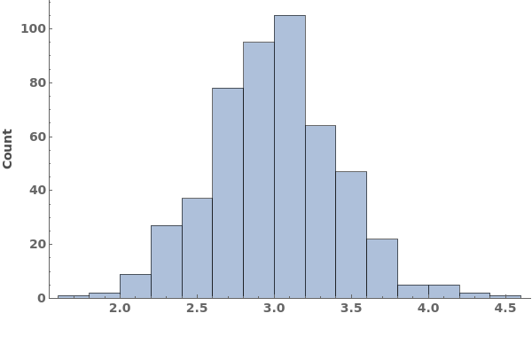
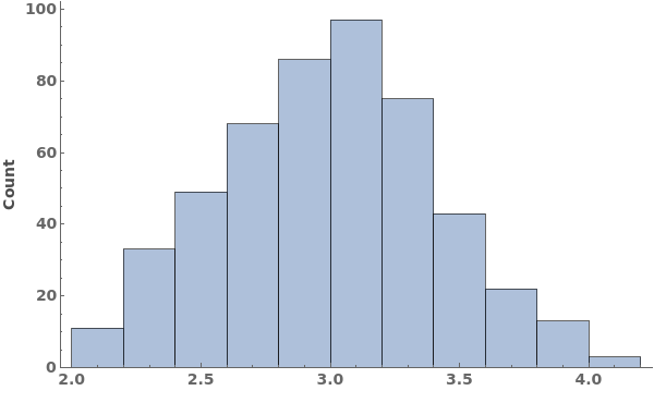
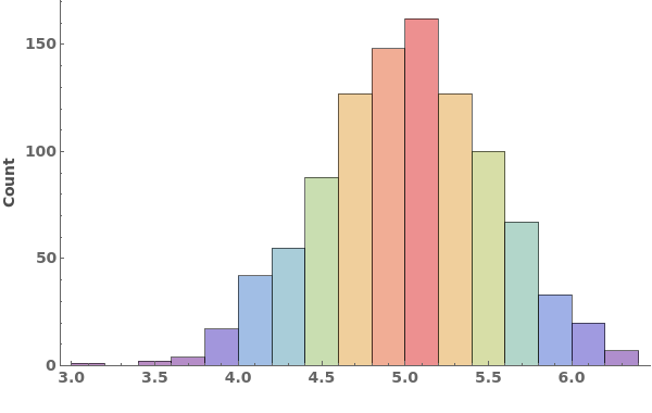
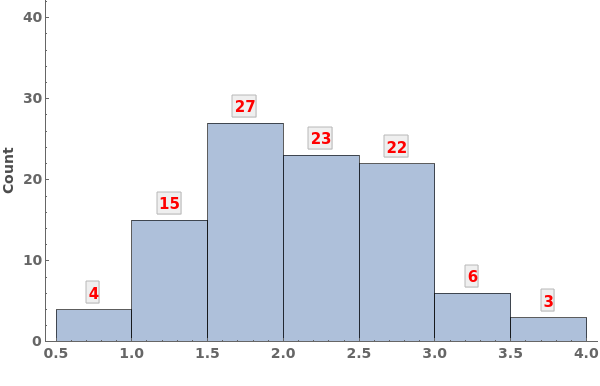
ecl-logo Documentation

EmeraldHistogram

EmeraldHistogram[dataset]chart

creates a Histogram from the provided dataset.
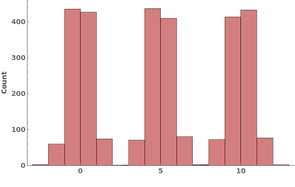
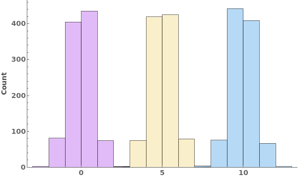
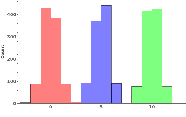
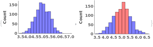
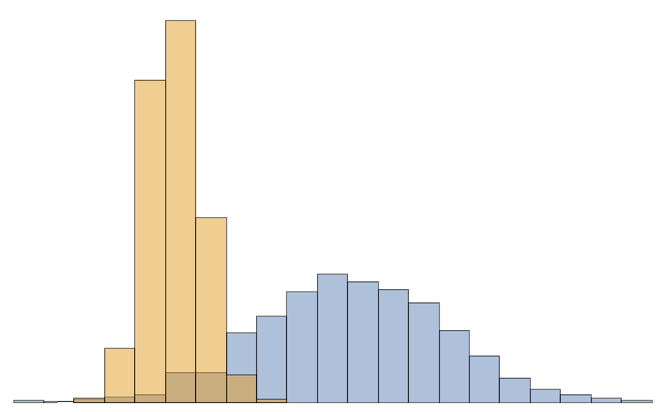
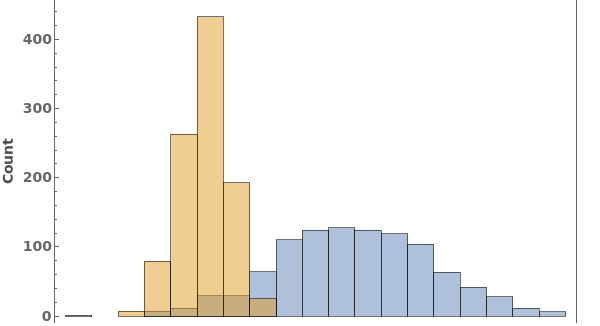
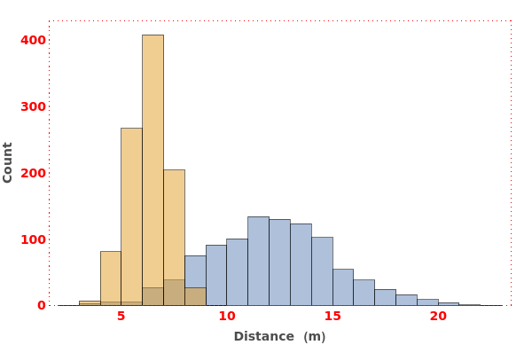
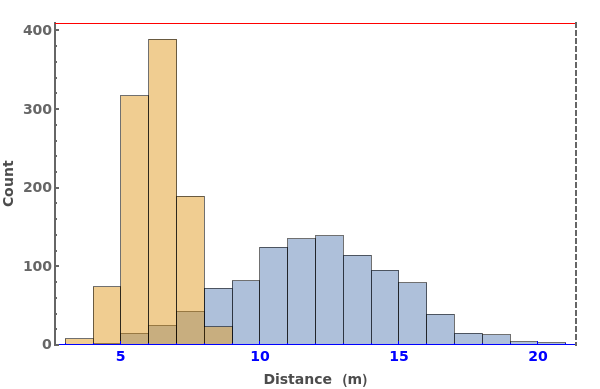
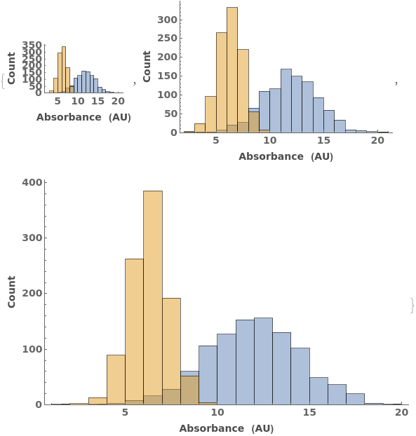
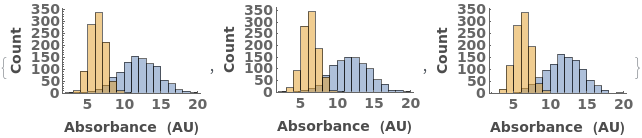
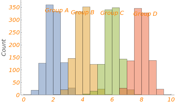
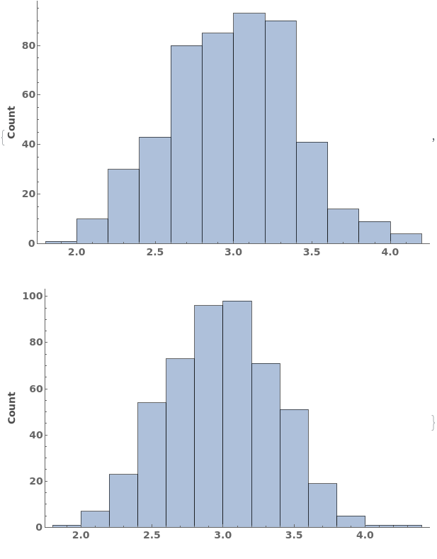
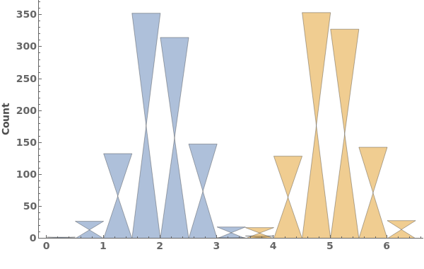
EmeraldHistogram[datasets]chart

creates a Histogram displaying each dataset in datasets.

Details

    Input
    Output
    Data Specifications Options
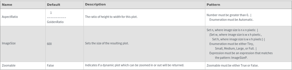
    Frame Options
    Grid Options
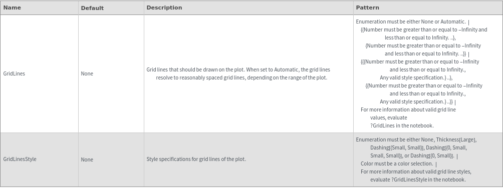
    Image Format Options
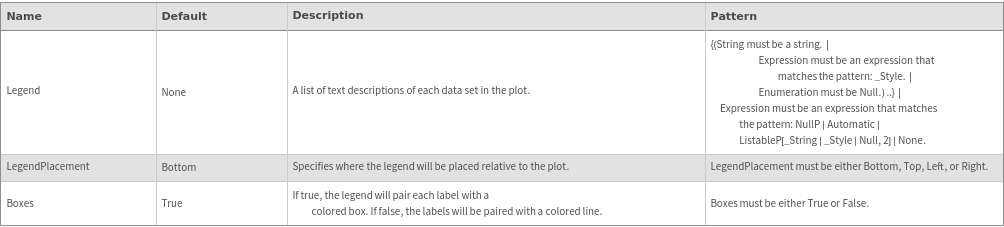
    Legend Options
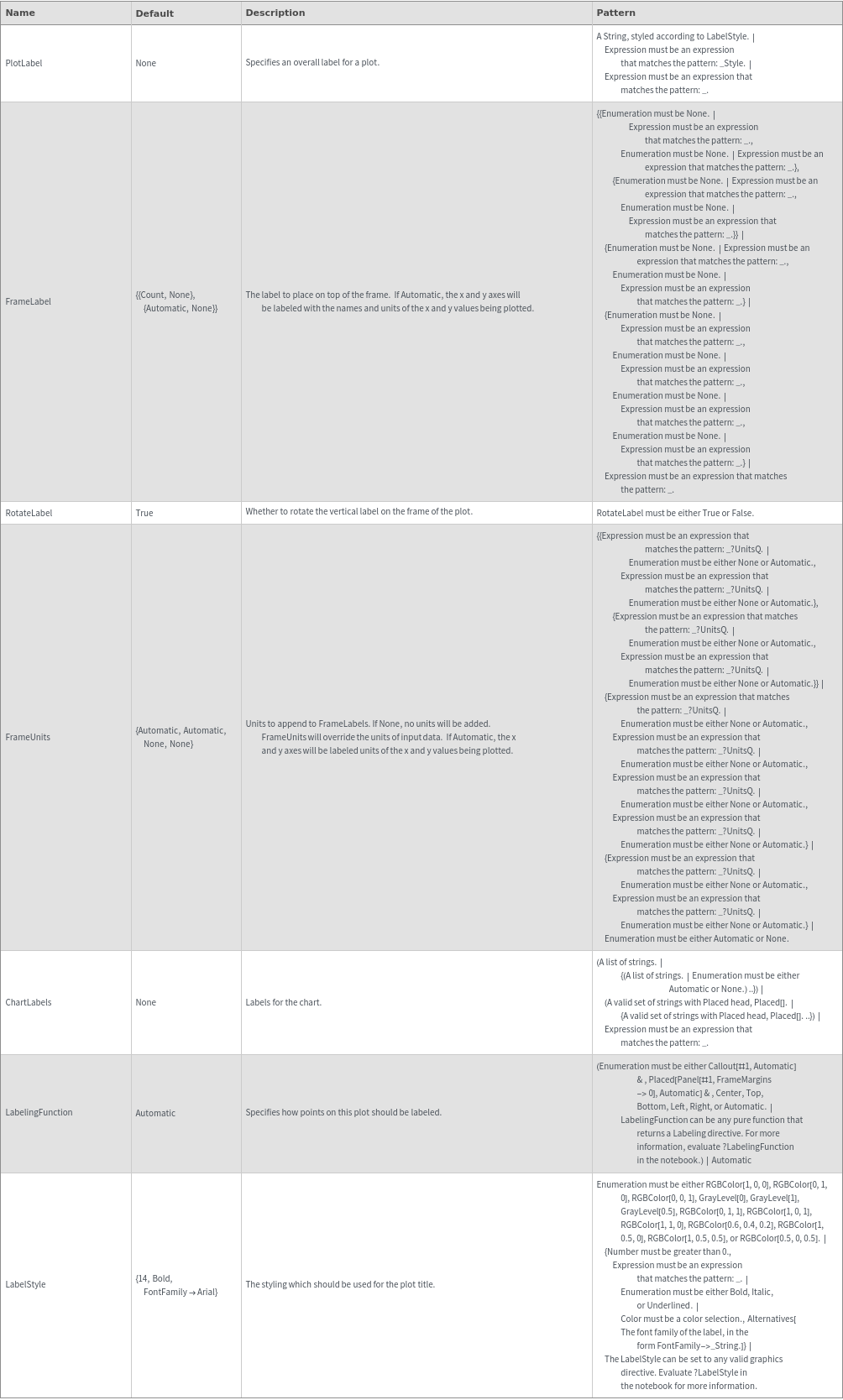
    Plot Labeling Options
    Plot Range Options
    Plot Style Options
    General Options

Examples

Basic Examples  (2)

Create a histogram:

Create a histogram containing multiple data sets:

Additional Examples  (8)
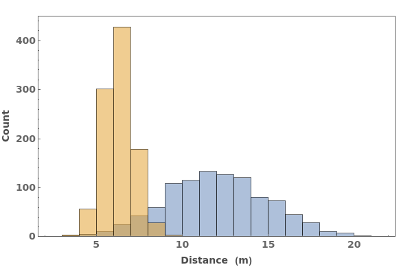
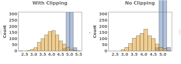
Missing Data  (3)

Null values in a data set are ignored:

Null values in any data set are ignored:

Entire missing data sets also ignored:

Quantity Arrays  (3)

Chart a single data set given as a QuantityArray:

A list of quantity array data sets:

Given a QuantityArray containing a single group of data sets:

Units  (2)

Data with units:

Data units can be different, but must be compatible:

Options  (56)

AspectRatio  (1)

Adjust the ratio of height to width in the output plot. Default is 1/GoldenRatio:

Background  (1)

Set the background color of the plot:

BarOrigin  (1)

Specify from which direction histogram bars should be drawn:

Boxes  (2)

Use swatch boxes in legend:

Use line segments in legend instead of swatch boxes:

ChartBaseStyle  (1)

Apply a style directive to all bars in the histogram:

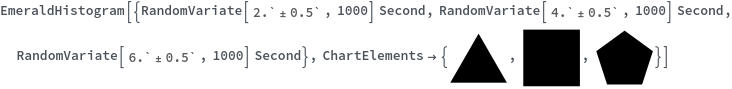
ChartElementFunction  (3)

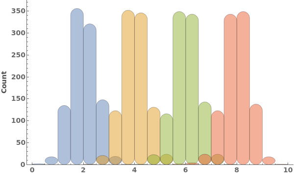
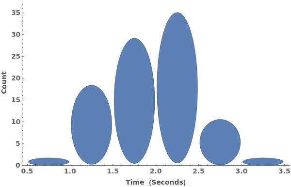
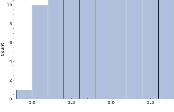
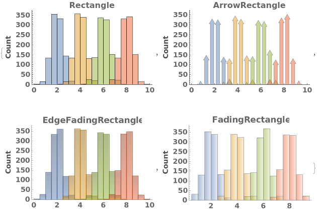
Choose a chart element function from a list of presets, which can be viewed by running ChartElementData["Histogram"] in the notebook. Automatic defaults to "Rectangle":

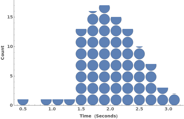
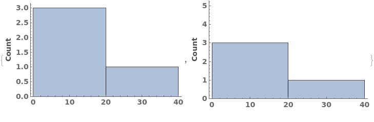
Write a custom chart element function which maps the corners of a rectangle to an arbitrary grahpics primitive:

Some built-in chart element functions take options. As an example, you can view the options for the default Rectangle function by running ChartElementData["Rectangle", "Options"] in the notebook:

ChartElements  (4)

Use any graphics primitive instead of bars in the histogram:

Use an image instead of bars in the histogram:

Stretch a graphic vertically to the bar height instead of generating additional copies:

Use different chart elements for each dataset in the plot:

ChartLabels  (1)

When multiple input datasets are provided, label each dataset:

ChartLayout  (1)

The ChartLayout for EmeraldHistogram can be specified as either "Overlapped" or "Stacked":

ChartStyle  (3)

Pass a single argument to ChartStyle to style all bars the same way:

Style the chart named color scheme from ColorData[]:

Pass a list of arguments to ChartStyle to apply different styles to each bar in each group:

ColorFunction  (2)

Specify a coloring function for the lines in our plot. To see all of the built in ColorFunctions, evaluate ColorData["Gradients"] in the notebook:

The color function for a histogram can be given explicitly as a function which converts a count to a style directive:

ColorFunctionScaling  (1)

By default, the color function uses scaled heights, where 1.0 is the maximum count. Absolute counts can be used by setting ColorFunctionScaling->False:

Epilog  (1)

Epilogs explicitly specified are joined onto any epilogs created by EmeraldHistogram:

Frame  (3)

Set Frame->True to use a frame on all four sides of the plot:

Set Frame->None to hide the frame:

Set Frame with format {{left,right},{bottom,top}} to selectively enable or disable frame walls:

FrameLabel  (2)

Specify frame labels for unitless data:

Override a default label:

FrameStyle  (2)

Apply styling to the frame of the plot:

Apply different stylings to each frame wall, referenced using {{left,right},{bottom,top}}:

FrameTicks  (1)

Set FrameTicks->None to disable ticks in the plot:

FrameTicksStyle  (2)

Apply styling to all FrameTicks in the plot:

Apply a different styling to each frame wall, using {{left,right},{bottom,top}} syntax:

FrameUnits  (1)

Specify a label and automatically append the data's units:

GridLines  (3)

Use either None or Automatic to specify {vertical,horizontal} gridlines:

Explicitly specify gridlines, e.g. to increase the grid resolution around particular values:

Specify each gridline as a {value,Directive} pair to apply specific styling to individual grid lines:

GridLinesStyle  (1)

Apply the same style to all grid lines in the plot:

ImageSize  (3)

Adjust the size of the output image:

Specify the size as a {width,height} pair:

Specify the size using keywords Small, Medium, or Large:

ImageSizeRaw  (1)

ImageSizeRaw is an option used for web-embedding, and otherwise has no effect on plot output:

LabelingFunction  (1)

Use a labeling function to automatically generate a label showing the counts in each histogram bar, in 15pt bolded red text:

LabelStyle  (1)

Apply a style directive to all label-like elements of the plot:

Legend  (2)

Specify a legend:

Specify a legend:

LegendPlacement  (1)

Specify legend position:

PlotLabel  (1)

Supply a plot title with PlotLabel:

PlotRange  (2)

Specify plot range for primary data. Units in PlotRange must be compatible with primary data units:

Can mix explicit specification with Automatic resolution:

PlotRangeClipping  (1)

PlotRangeClipping determines whether plot elements will be drawn outside of the plot range, and is set to True by default:

Prolog  (1)

Use Prolog to render graphics primitives prior to Histogram graphics such that they are rendered behind histogram bars:

RotateLabel  (1)

By default, the y-axis frame label is rotated. Set RotateLabel->False to leave the label horizontal:

Scale  (1)

Create a Log Histogram:

TargetUnits  (2)

Specify target x-unit for data. If Automatic, the value is taken as the data's unit. TargetUnits must be compatible with the data's units:

Incompatible target unit triggers a message and returns $Failed:

Zoomable  (1)

Make the plot zoomable:

Messages  (2)

IncompatibleUnits  (2)

Incompatible units within a data set:

Incompatible units across data sets: