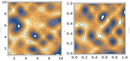
EmeraldListContourPlot
EmeraldListContourPlot[zvalues]⟹chart
creates a ListContourPlot from the input zvalues.
EmeraldListContourPlot[dataset]⟹chart
creates a ListContourPlot from the input dataset.
Details
Input
Output

Data Specifications Options
Frame Options
Grid Options
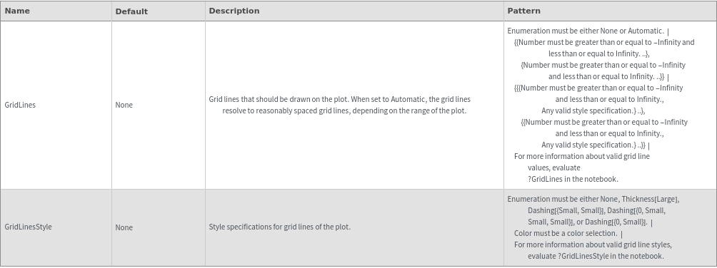
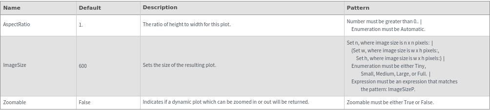
Image Format Options
Legend Options
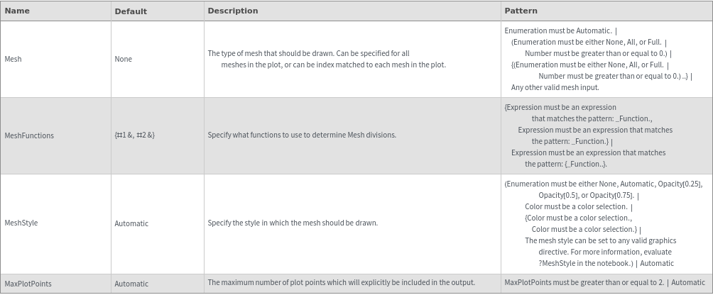
Mesh Options
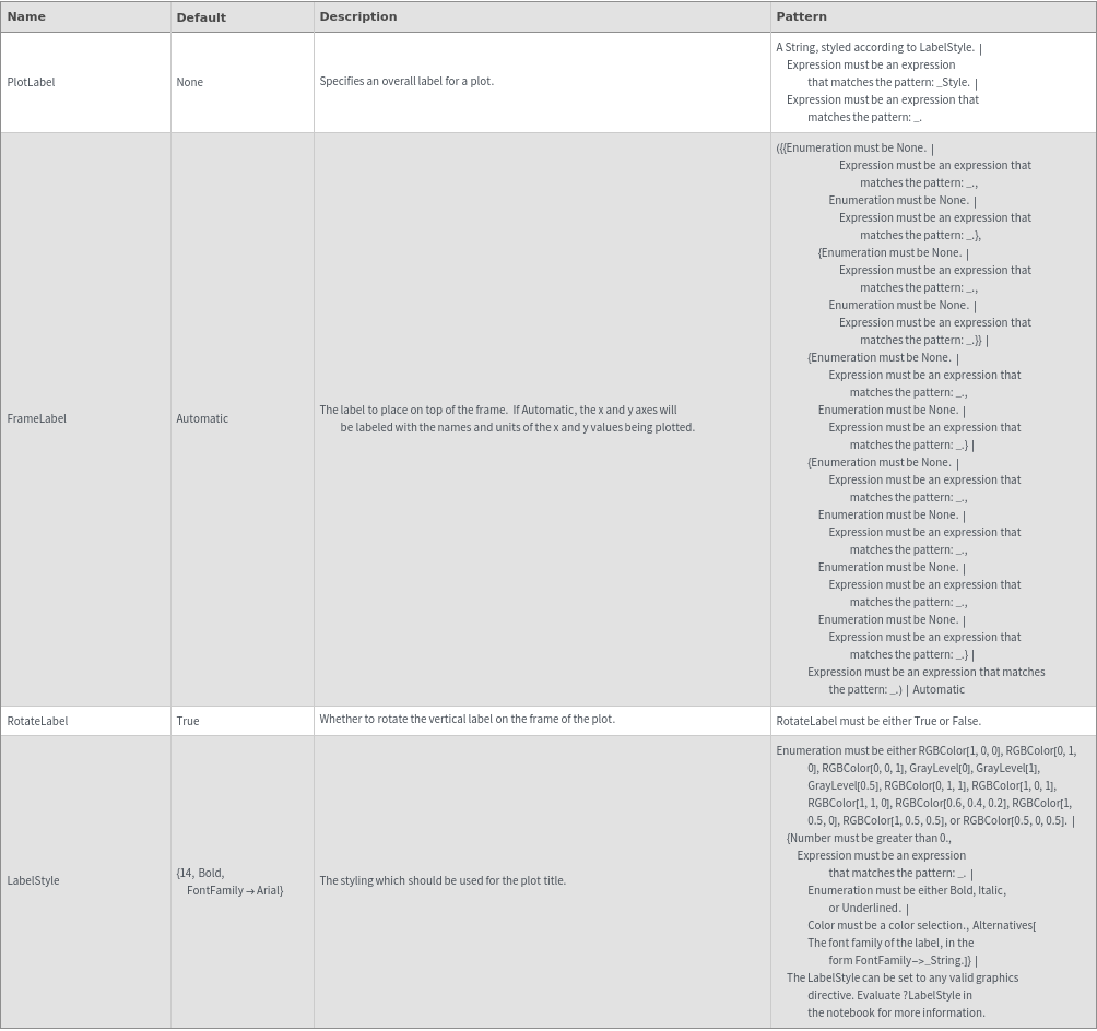
Plot Labeling Options
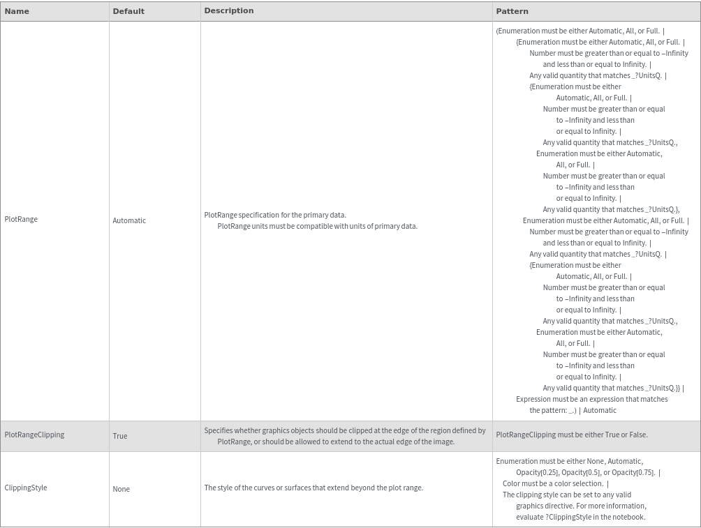
Plot Range Options
Plot Style Options
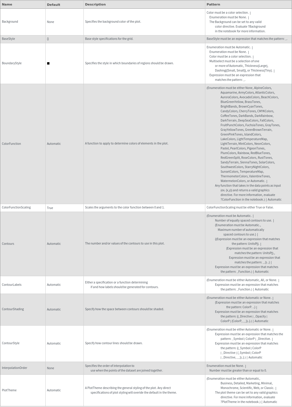
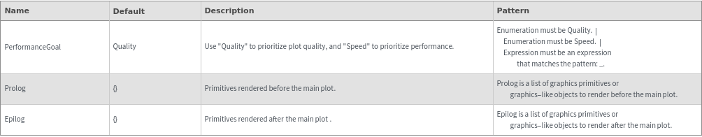
General Options
Examples
Basic Examples (3)


Options (80)

Background (2)


BaseStyle (2)


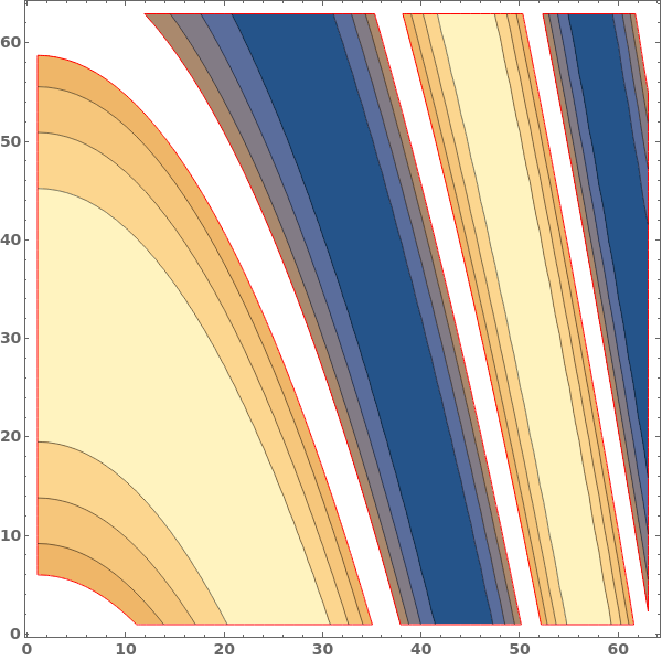
BoundaryStyle (4)


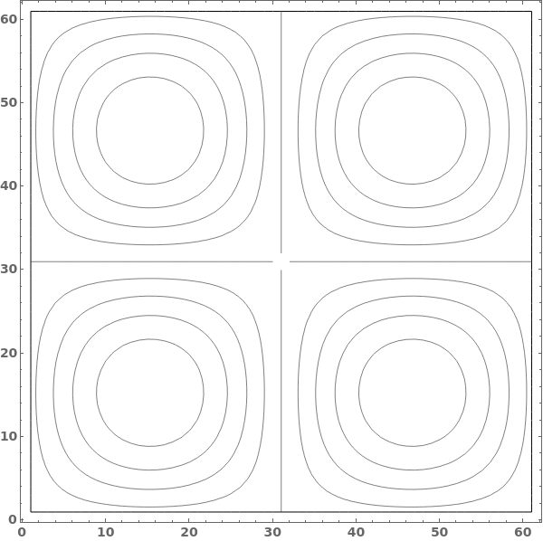
ClippingStyle (4)


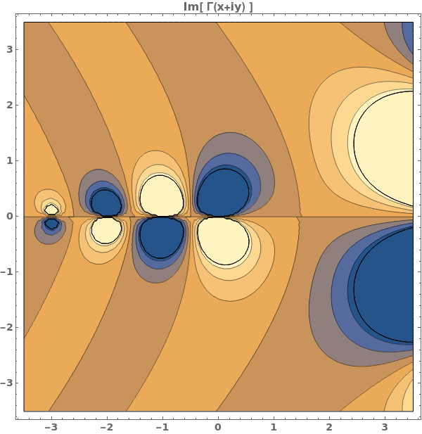

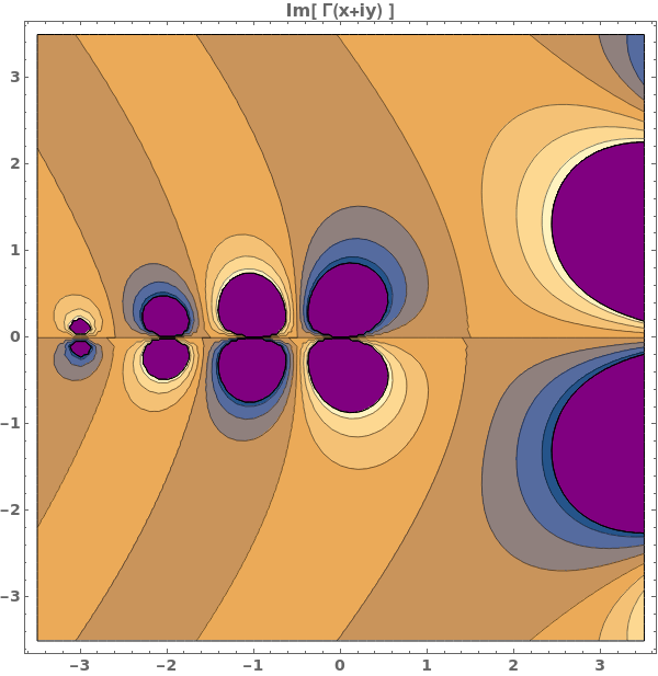

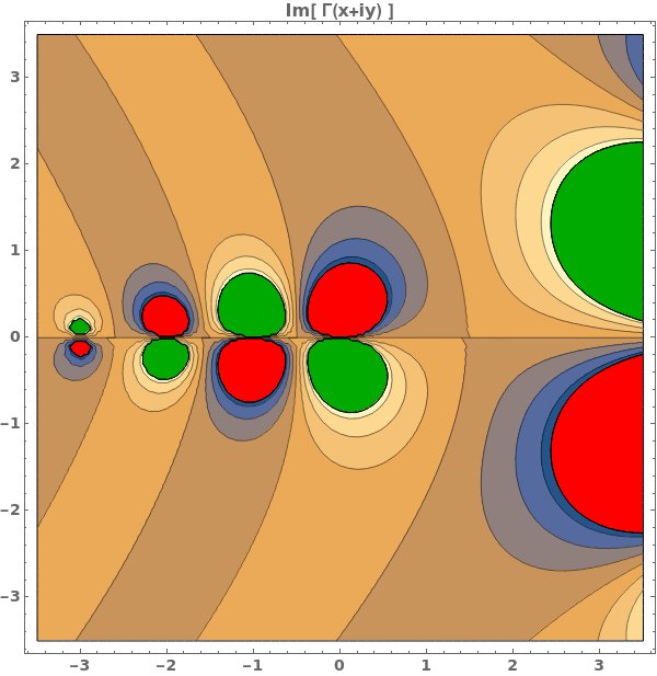
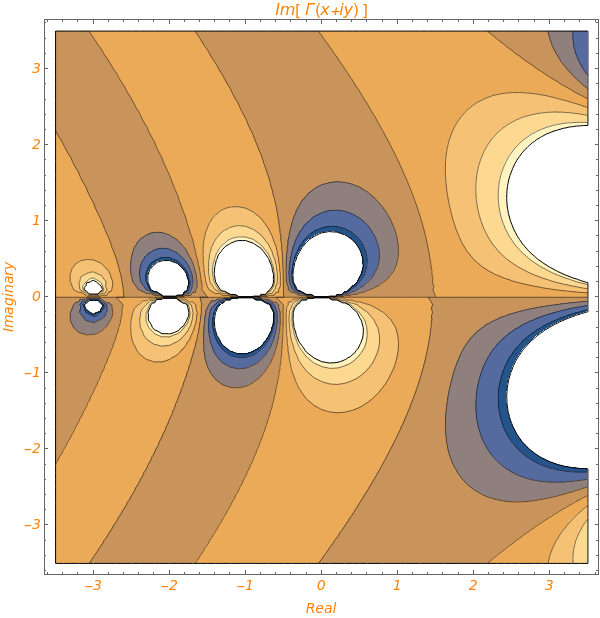
ColorFunction (2)


ColorFunctionScaling (1)

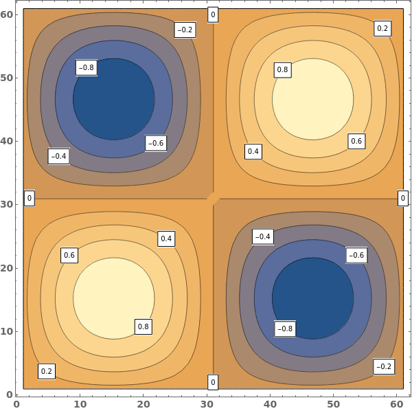
ContourLabels (2)


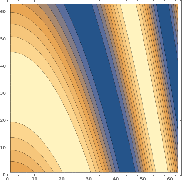
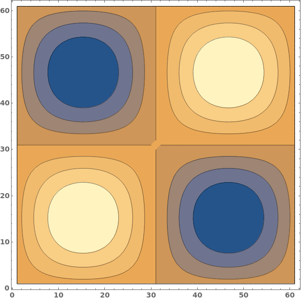
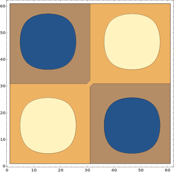
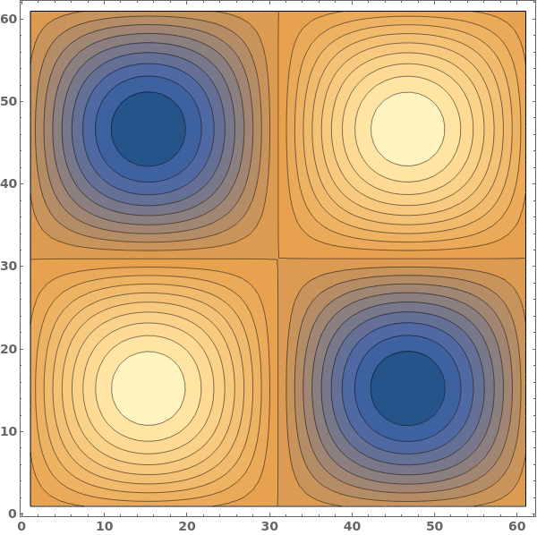
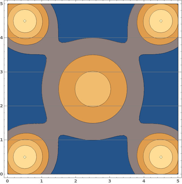
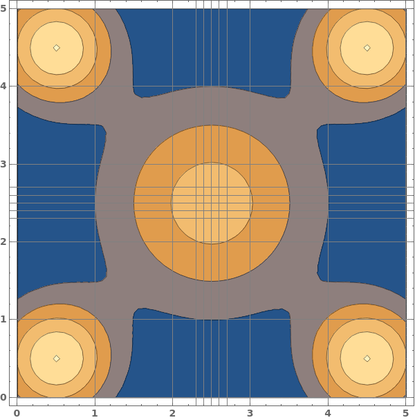
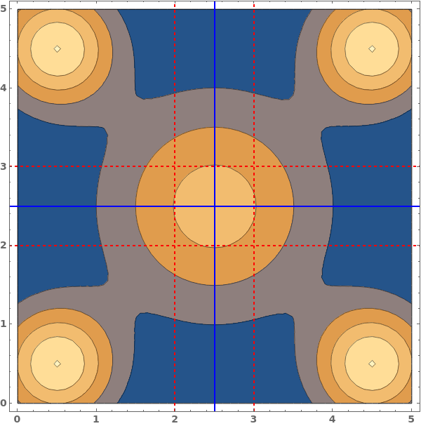
Contours (6)
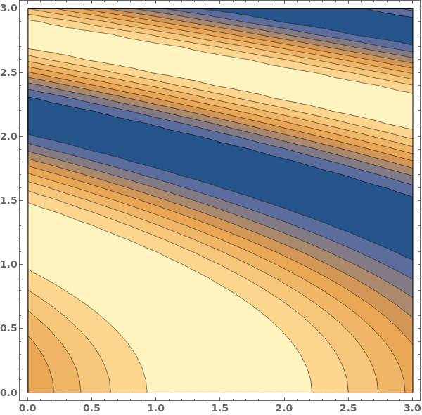
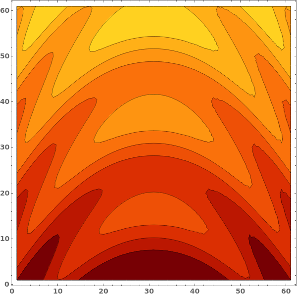
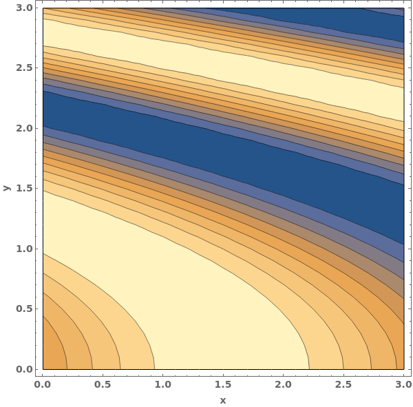
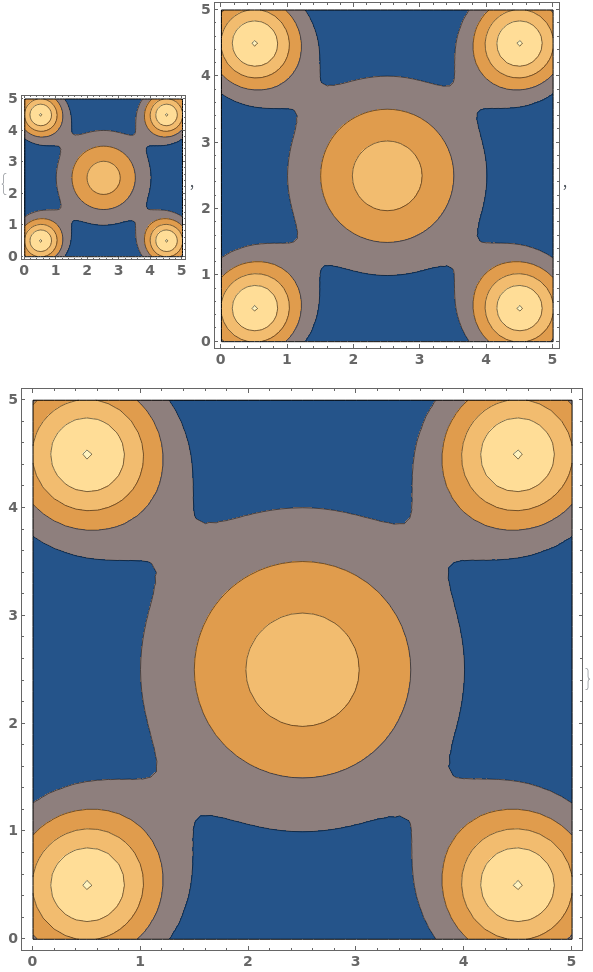
By default, use automatic contour selection:


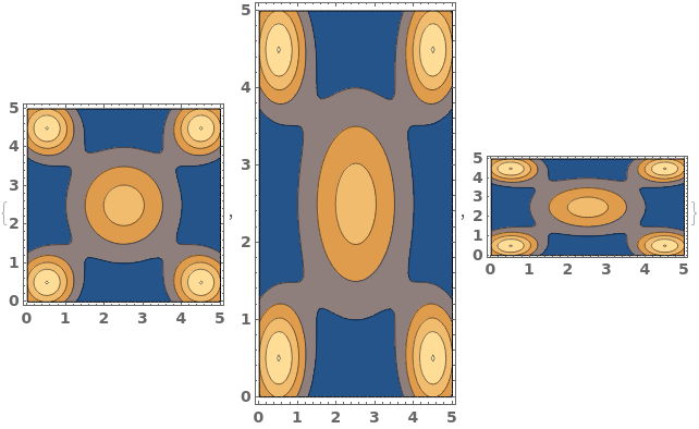
Use seven equally spaced contours:

Use at most five automatically selected contours:

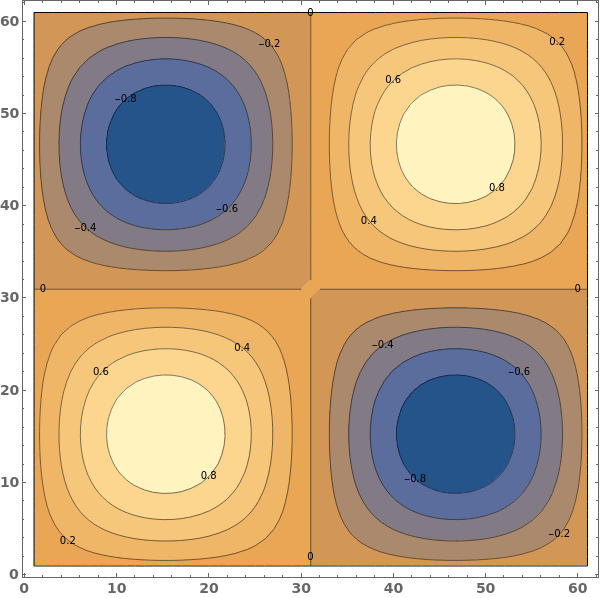
Use specific contour values at -0.5, 0.0, and 0.5:

Apply styling to specific contours:

Use a function, which takes the minimum and maximum data values, to generate contours:

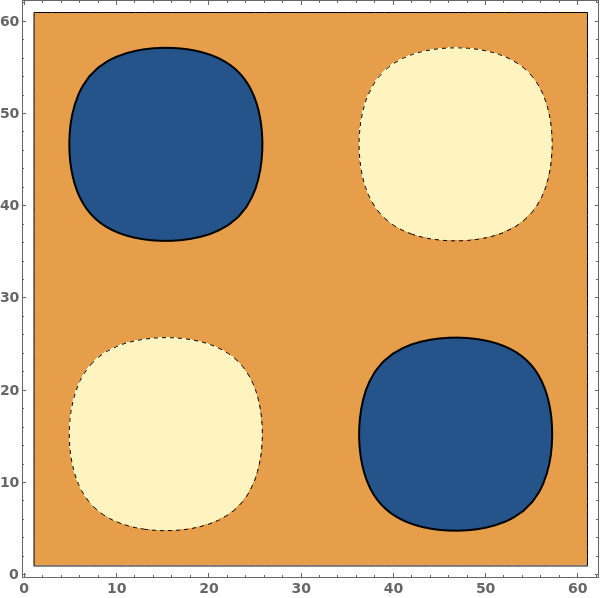
ContourShading (5)
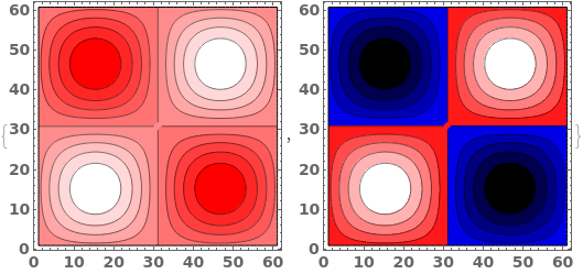
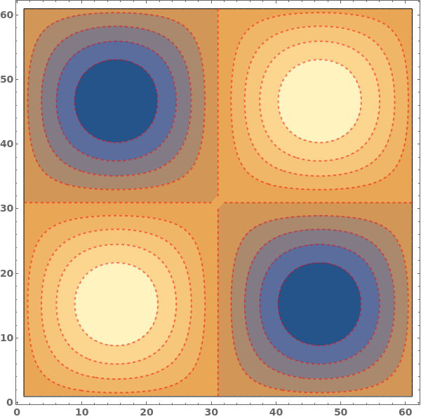
Automatic shading is dark at low values and lighter at high values:

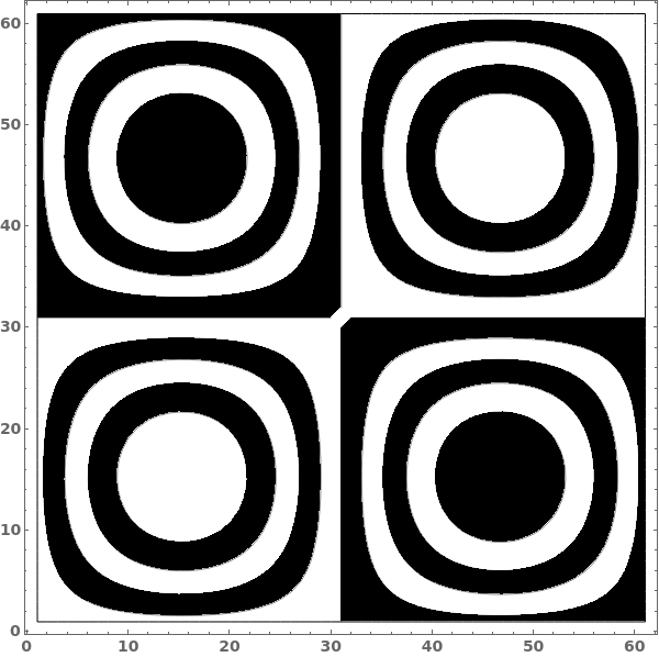
Use ContourShading->None to only show contour lines:

Shade contours with alternating colors:

Include style directives with the colors in the contour shadings:


When a list of colors is provided, contours will be shaded in order, repeating through the list if there are more contours than colors:

ContourStyle (5)


DataRange (1)


Frame (2)


FrameStyle (2)


FrameTicksStyle (2)


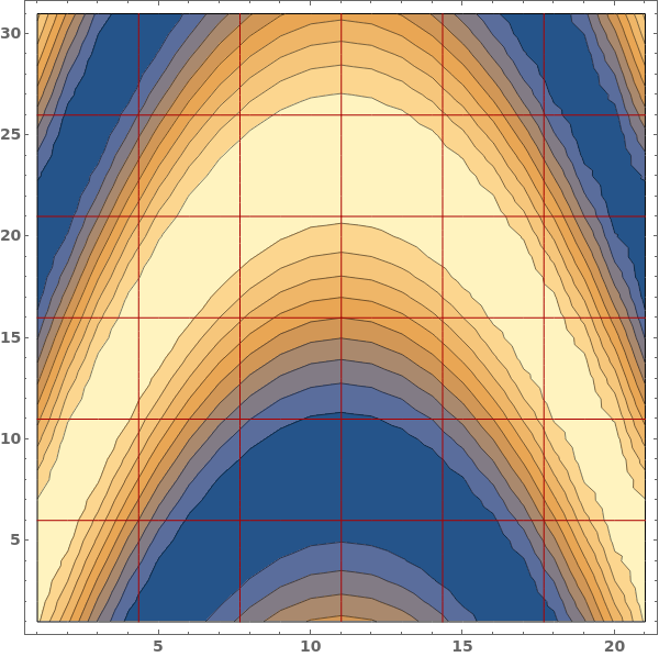
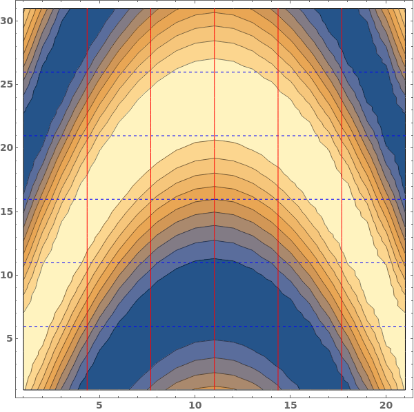
GridLines (3)


ImageSize (3)


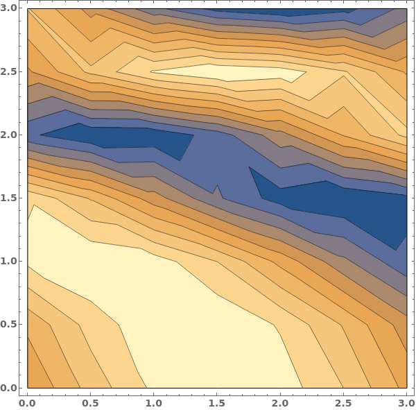
InterpolationOrder (2)


LabelStyle (1)

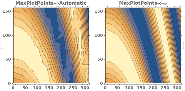
MaxPlotPoints (2)
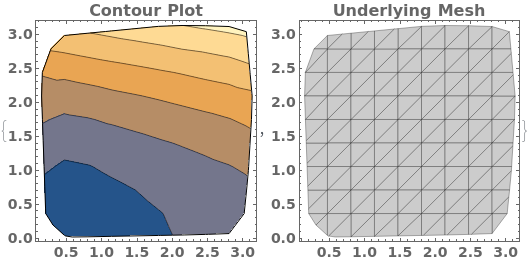
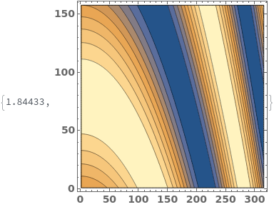
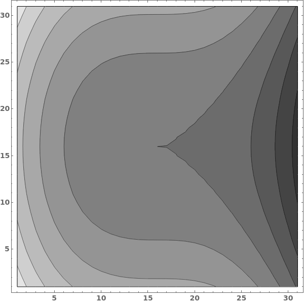
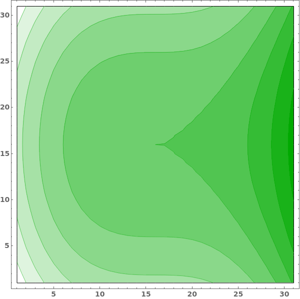
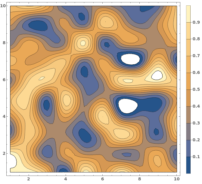
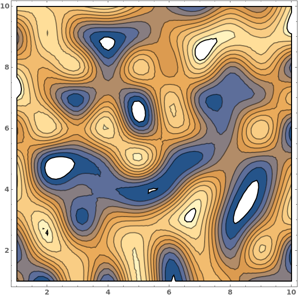
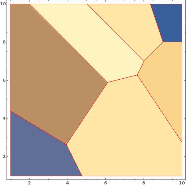
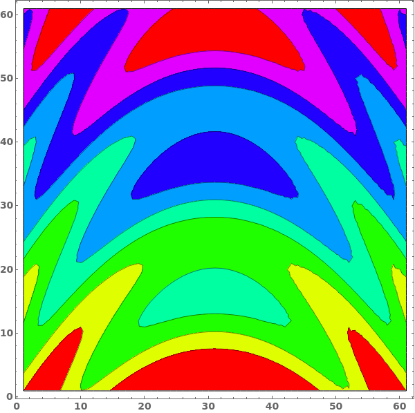
When a contour plot is plotted, a mesh connecting all input data points is created. We can view the mesh by disabling Contours and showing the Mesh - in this example, data points were sampled randomly:

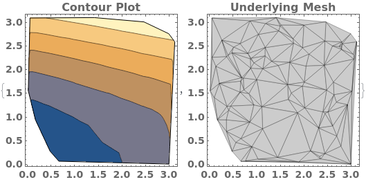
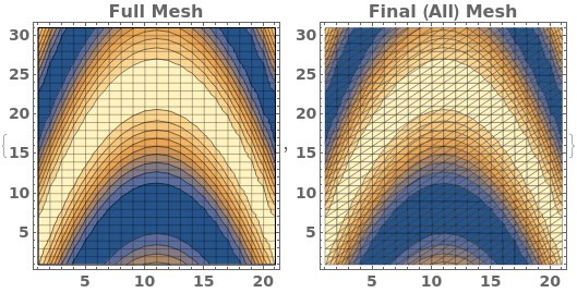
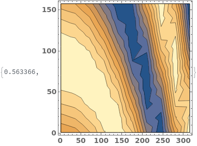
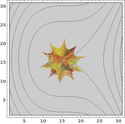
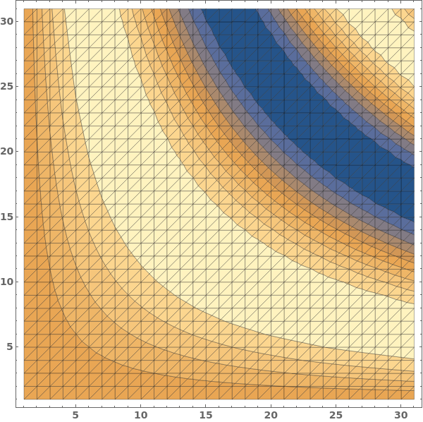
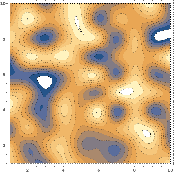
MaxPlotPoints limits the number of sampling points in the underlying mesh in each direction. If the input data has an uneven mesh, as in this example, data will be resampled to a regular grid: