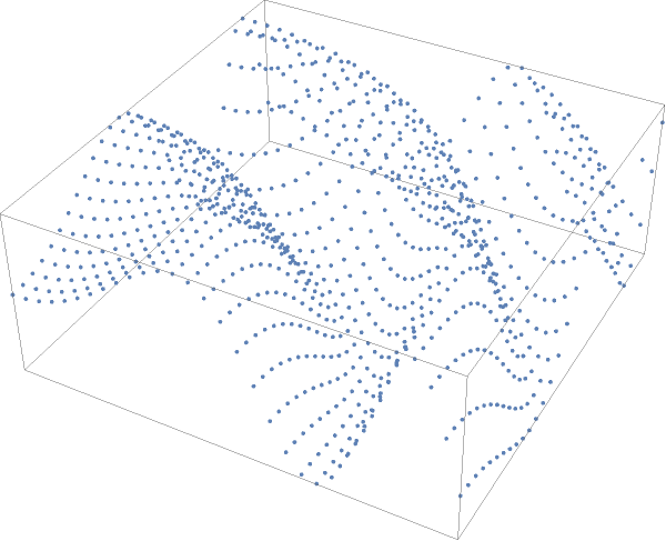
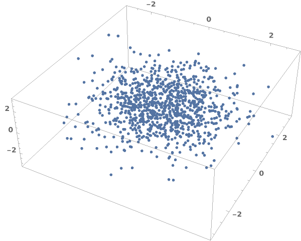
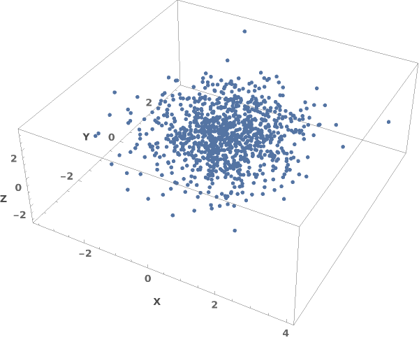
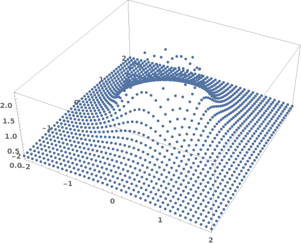
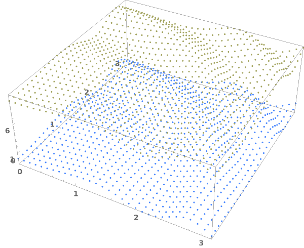
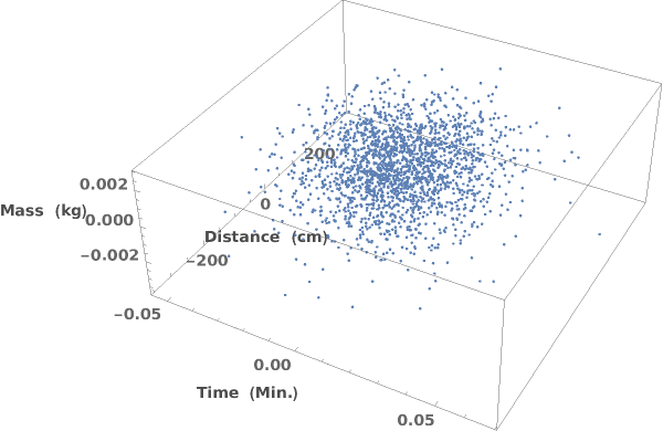
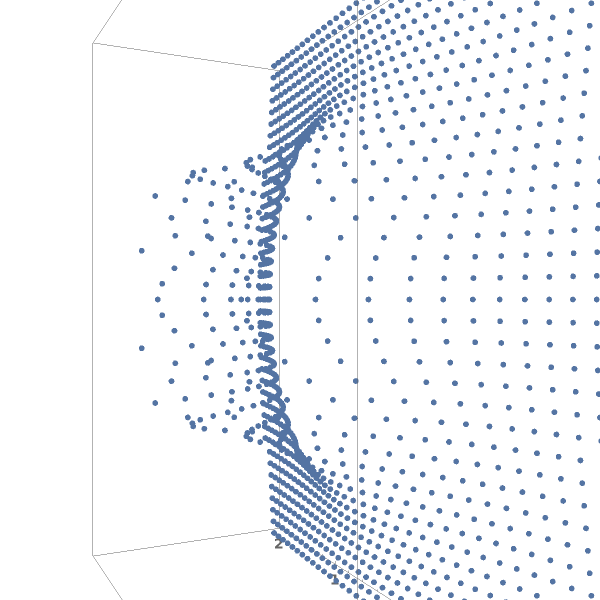
EmeraldListPointPlot3D
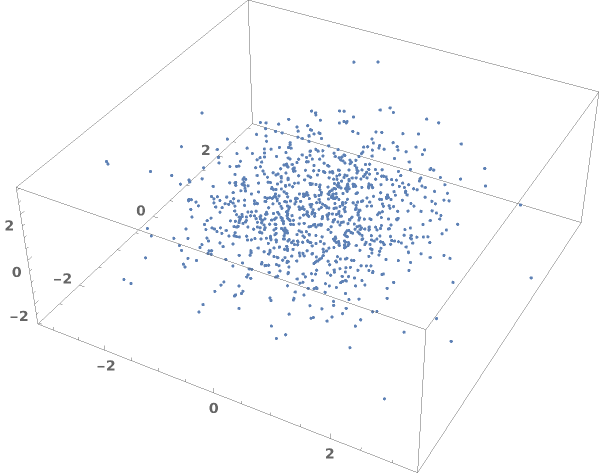
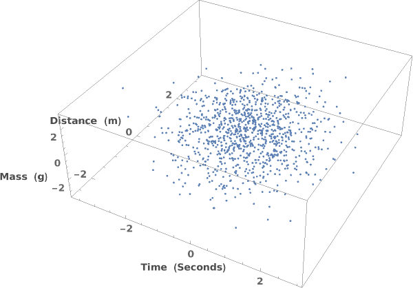
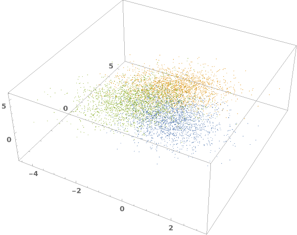
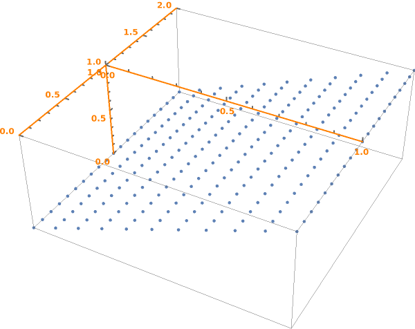
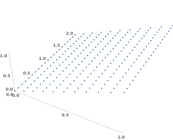
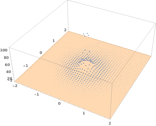
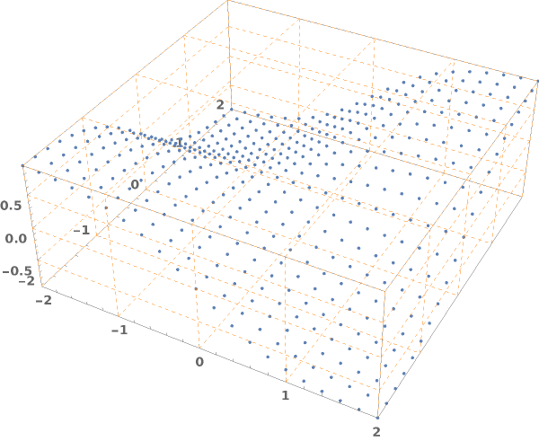
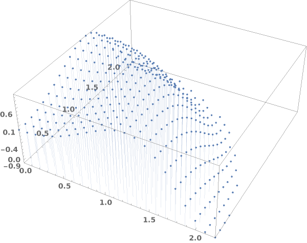
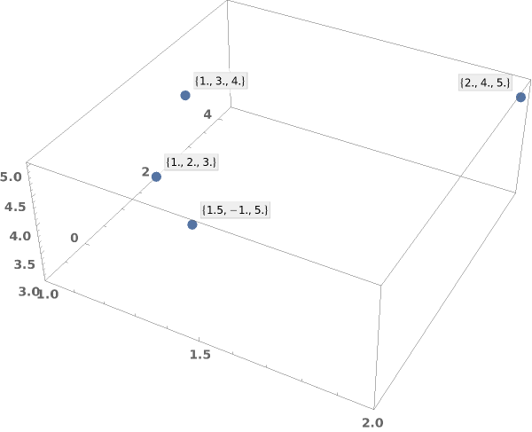
EmeraldListPointPlot3D[dataset]⟹plot3D
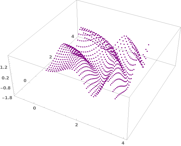
creates a ListPointPlot3D of dataset.
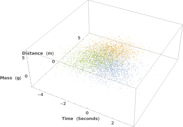
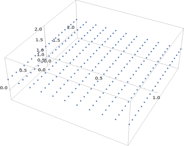
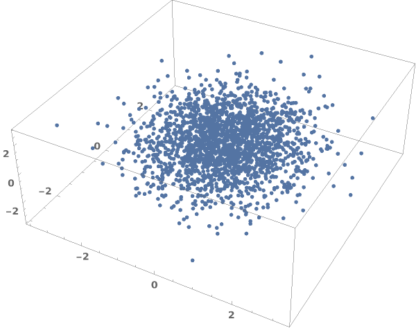
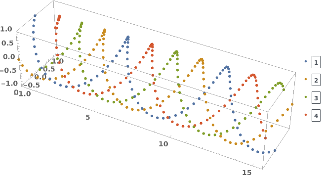
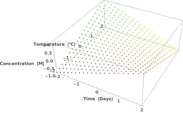
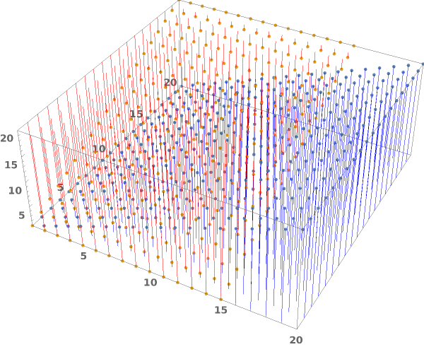
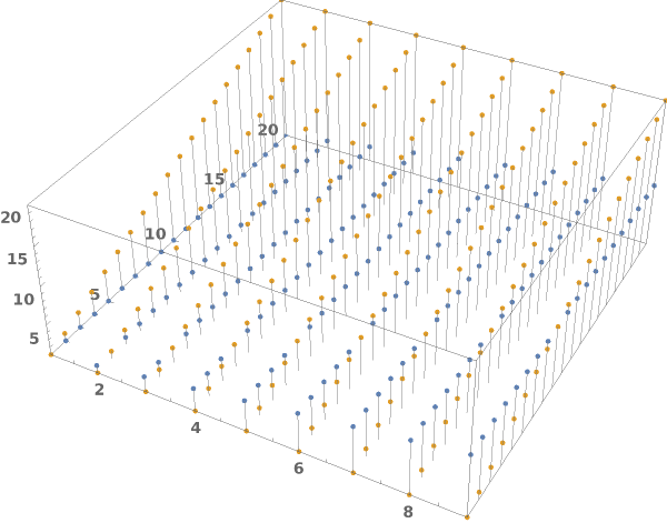
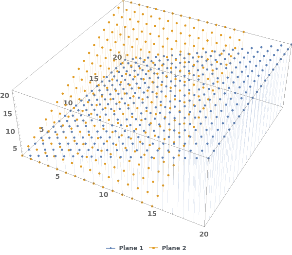
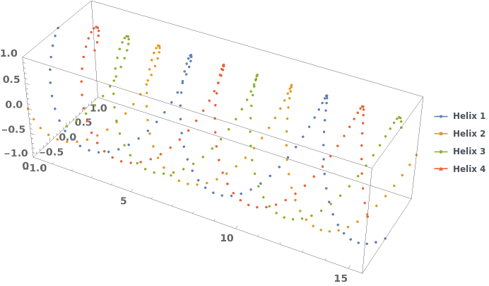
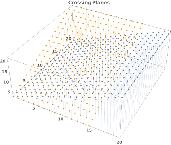
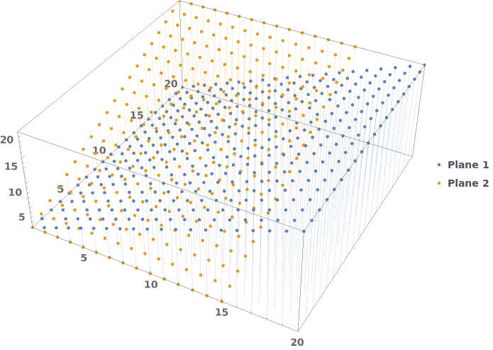
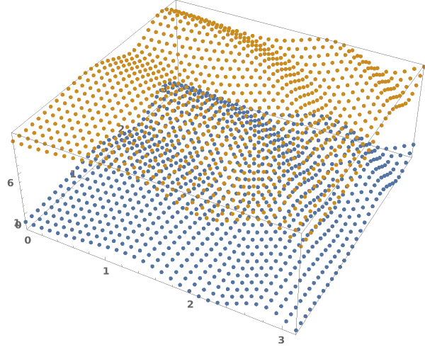
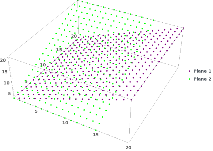
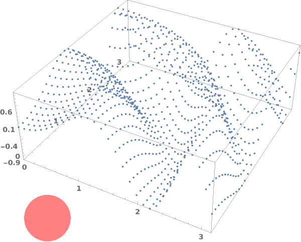
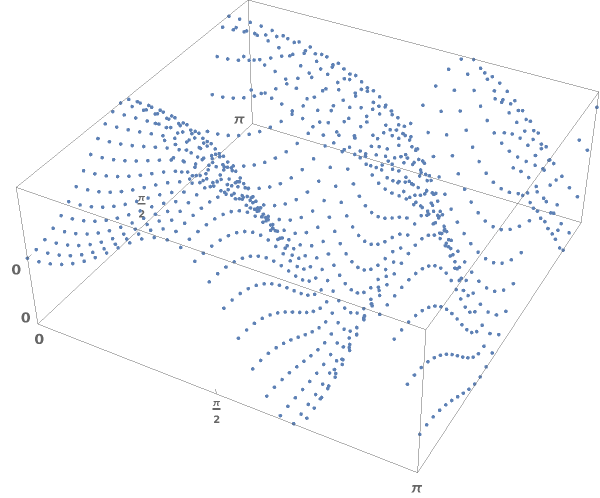
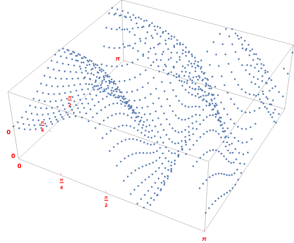
EmeraldListPointPlot3D[datasets]⟹plot3D
creates a ListPointPlot3D displaying each dataset in datasets.
Details
Input
Output

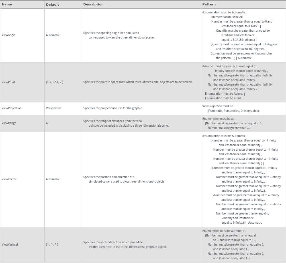
3D View Options
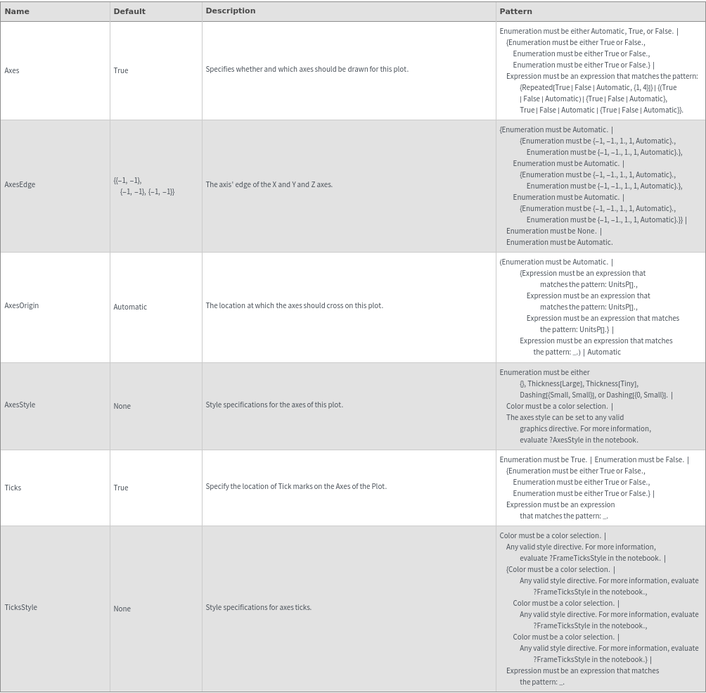
Axes Options
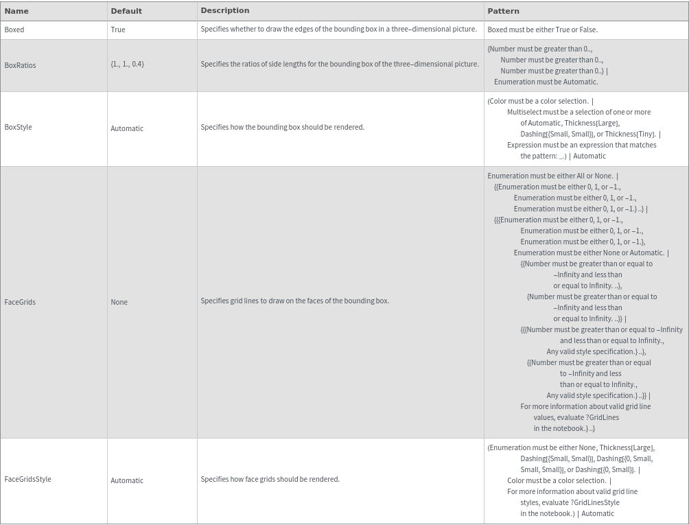
Box Options
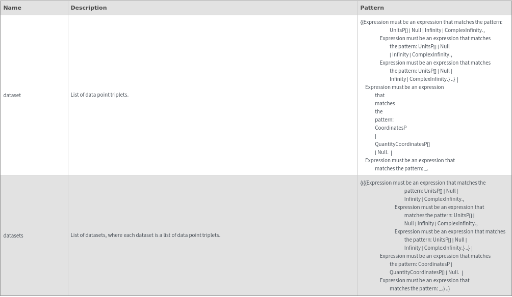
Data Specifications Options
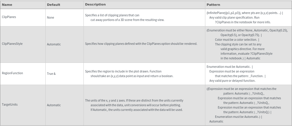
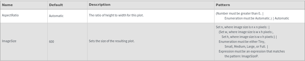
Image Format Options
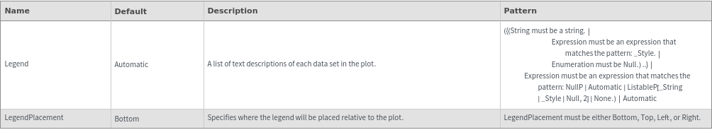
Legend Options
Plot Labeling Options
Plot Range Options
Plot Style Options
General Options