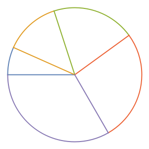
EmeraldPieChart
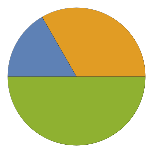
EmeraldPieChart[dataset]⟹chart
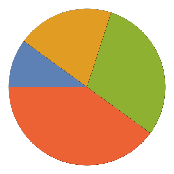
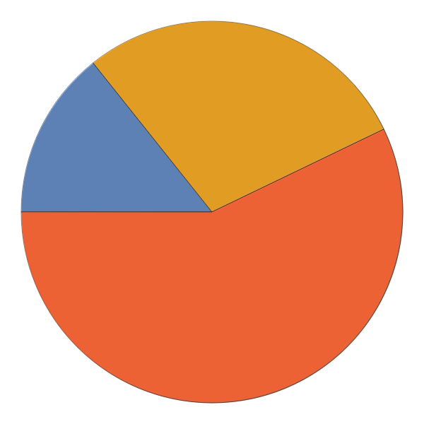
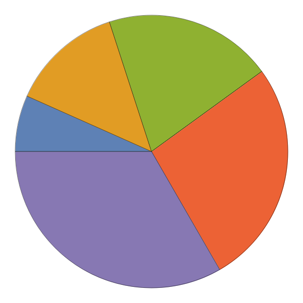
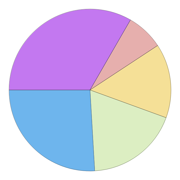
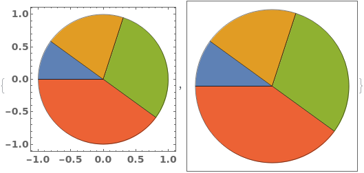
creates a PieChart of dataset.
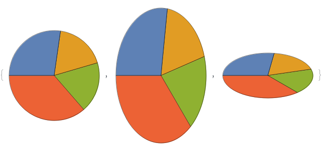
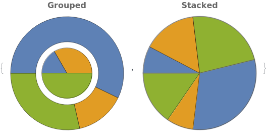
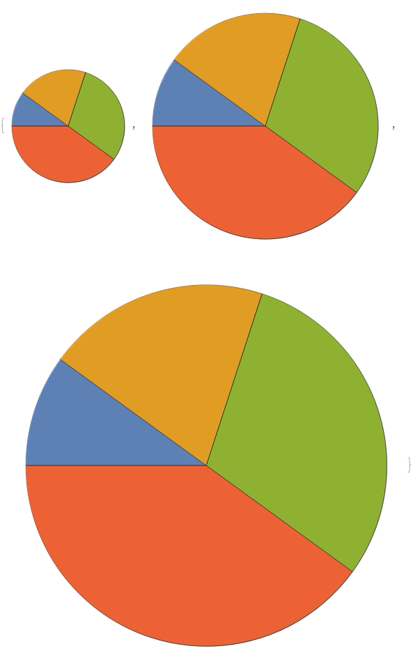
EmeraldPieChart[datasets]⟹chart
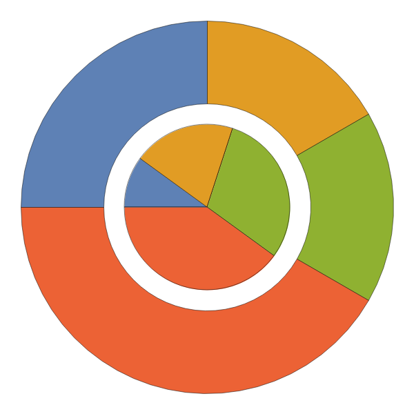
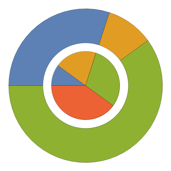
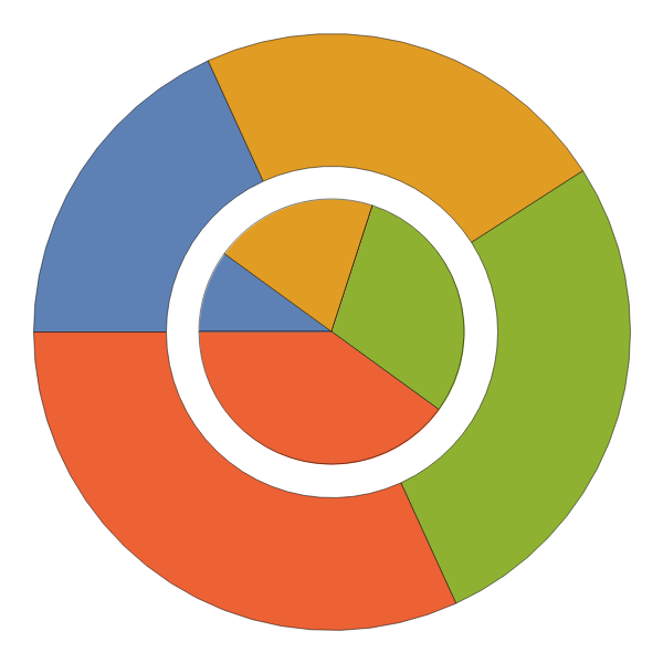
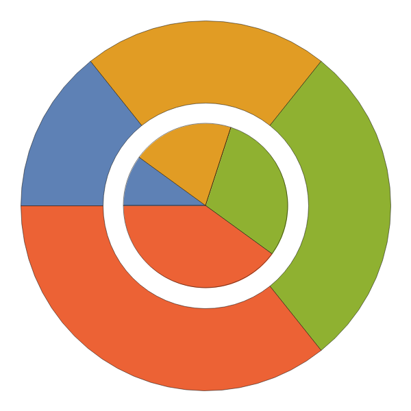
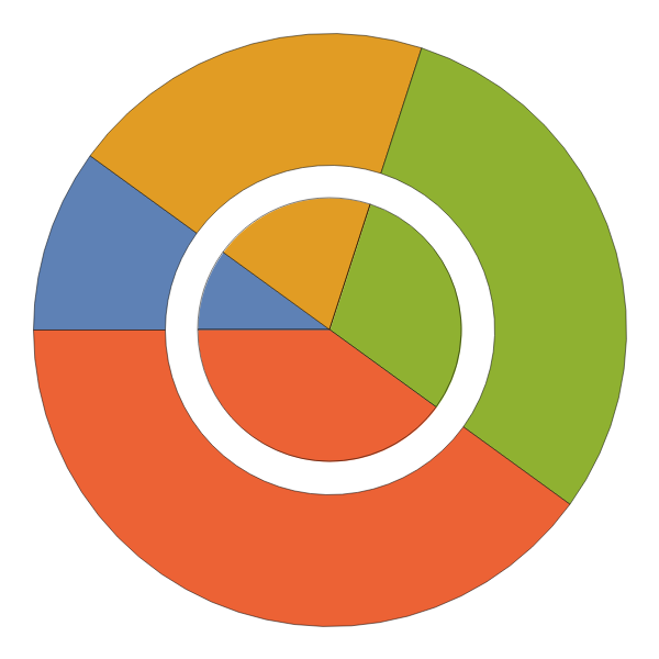
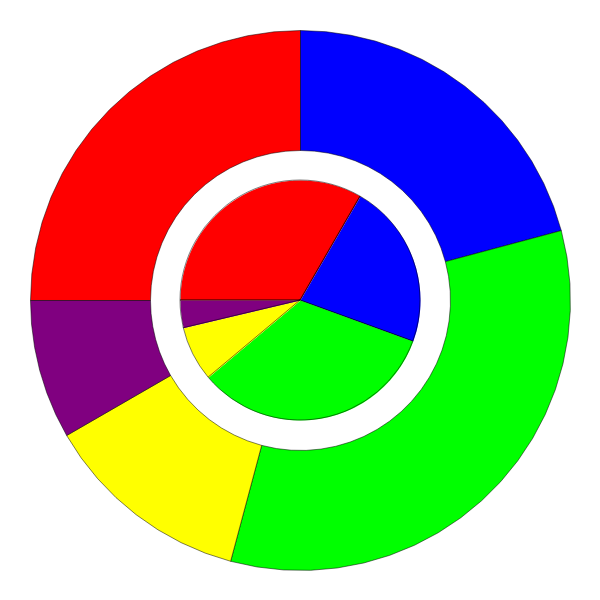
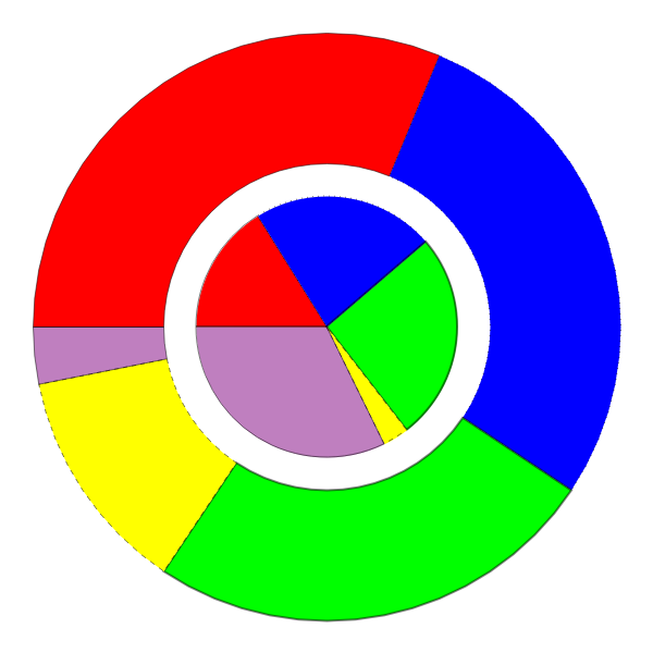
creates a PieChart displaying each dataset in datasets.
Details
Input
Output

Data Specifications Options

Frame Options
Grid Options
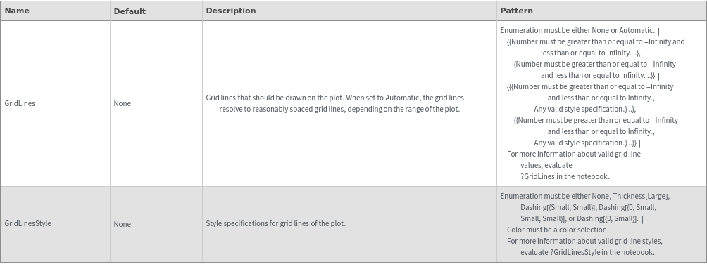
Image Format Options
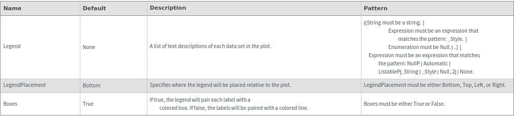
Legend Options
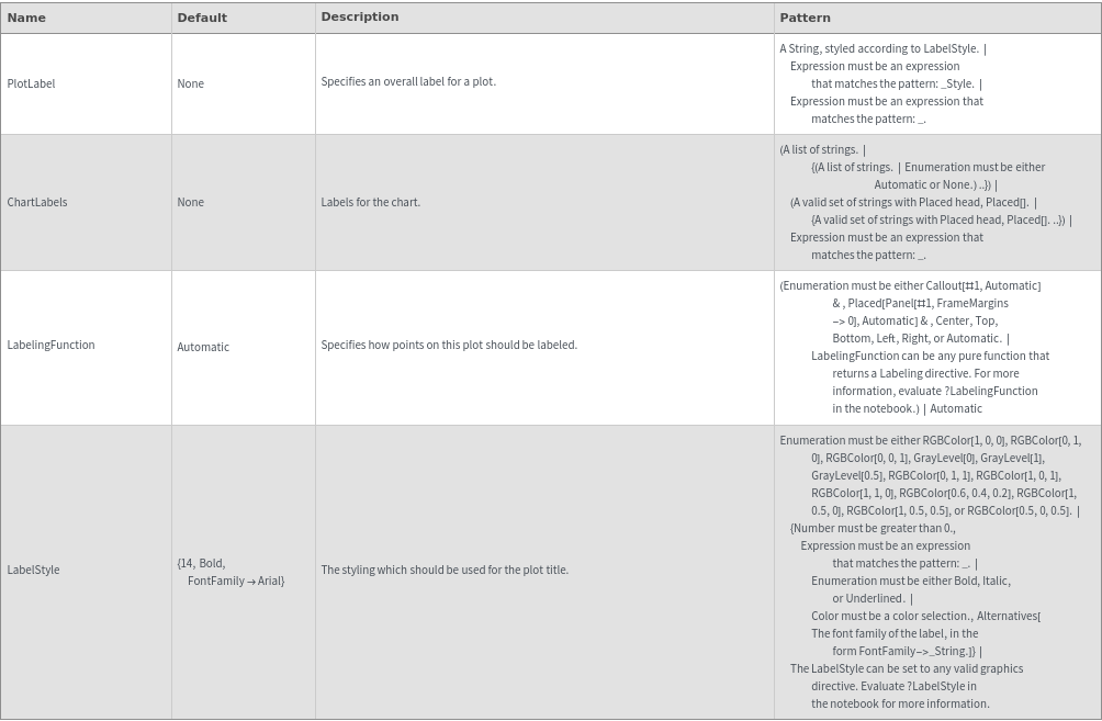
Plot Labeling Options
Plot Style Options
General Options
Examples
Basic Examples (2)


Additional Examples (9)
Missing Data (4)


Quantity Arrays (3)


Options (65)


ChartBaseStyle (3)


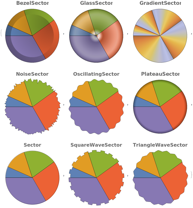
ChartElementFunction (3)


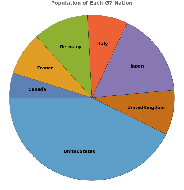
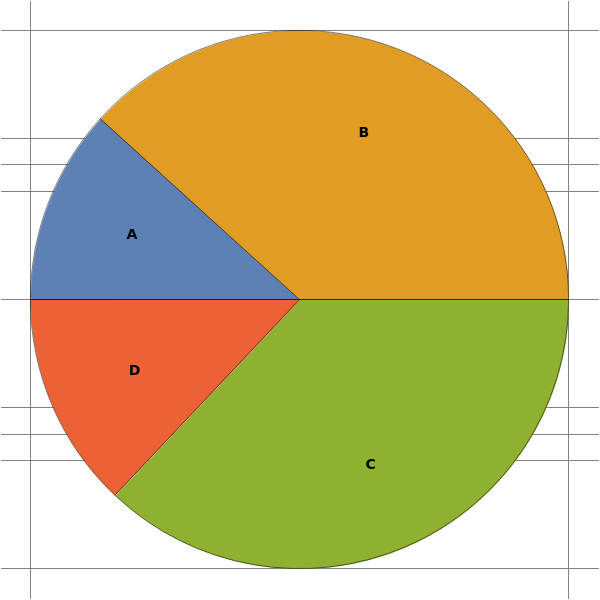
ChartLabels (2)


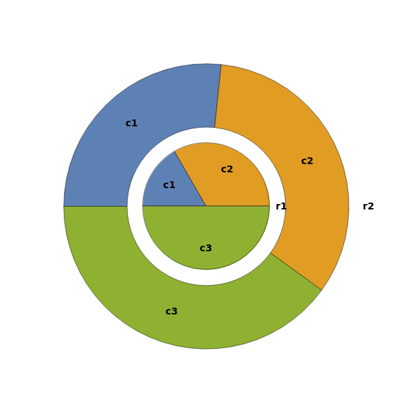
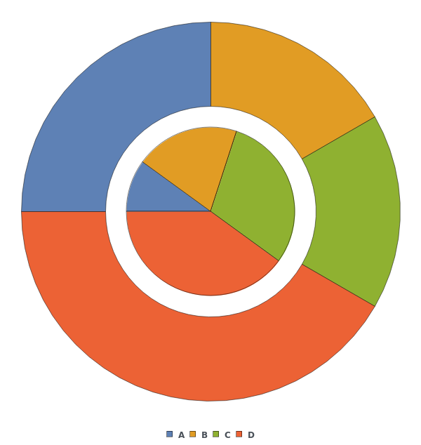
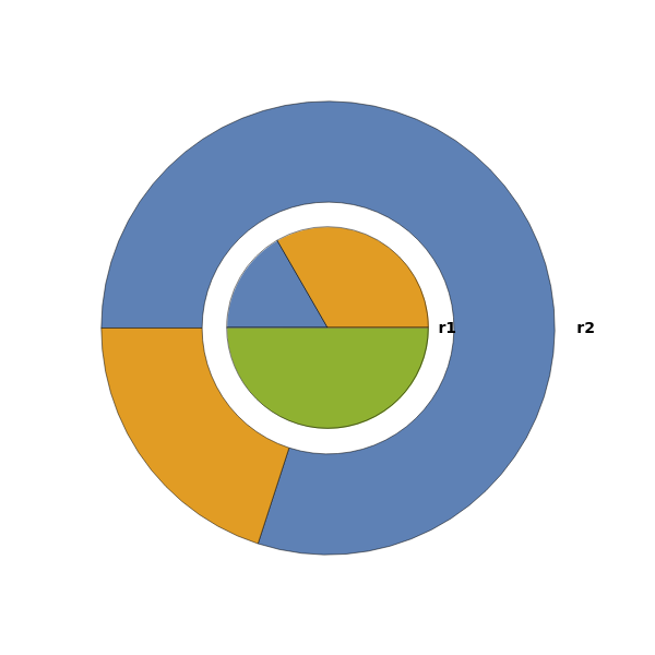
ChartLayout (1)

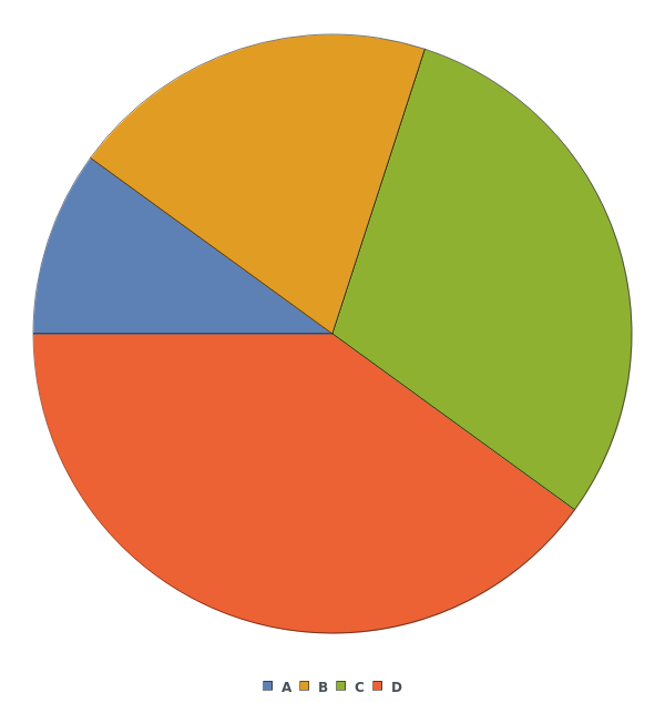
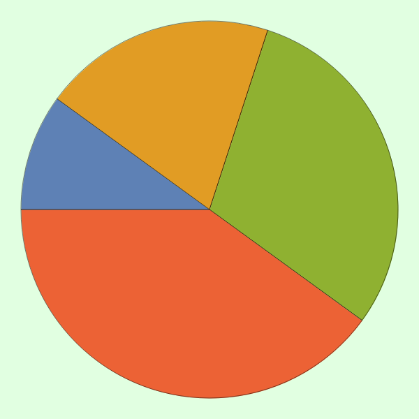
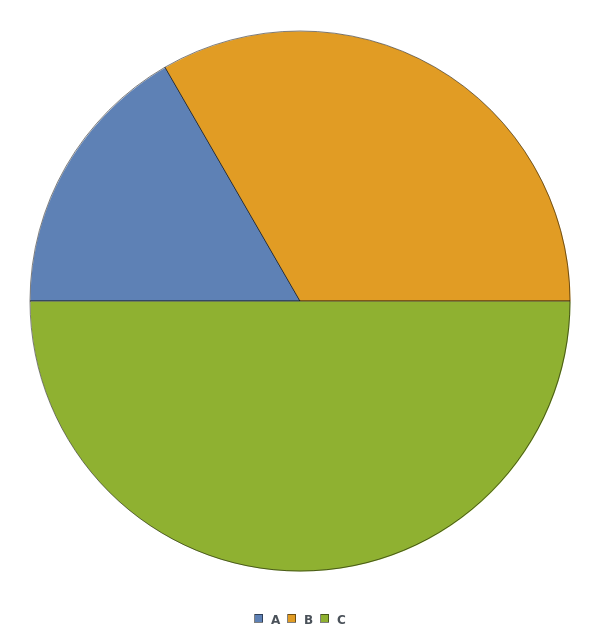
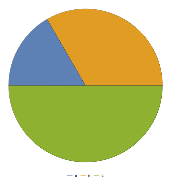
ChartLegends (3)


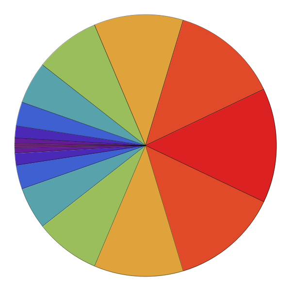
ChartStyle (7)
Pass a single argument to ChartStyle to style all sectors the same way:

Style the chart using a named color scheme from ColorData[]:

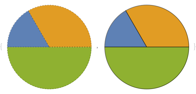
Pass a list of colors to ChartStyle to apply different styles to each sector in each group:

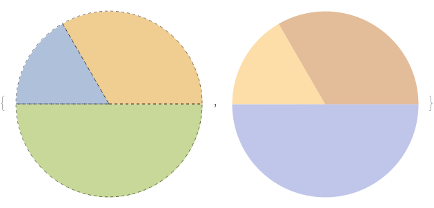
Pass a list of style directives to ChartStyle to apply different styles to each sector in each group:

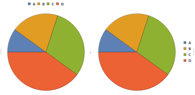
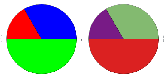
Style each group the same way:

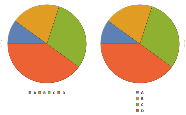
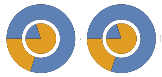
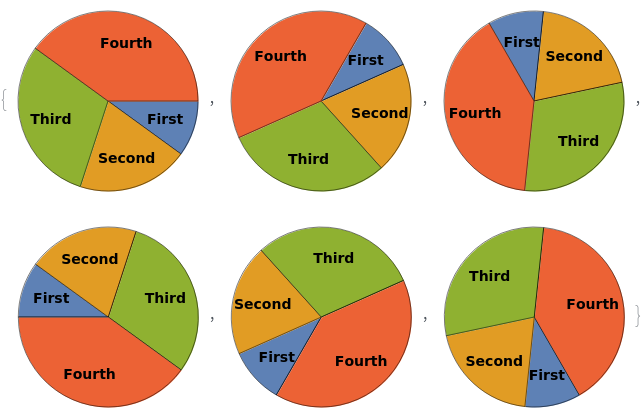
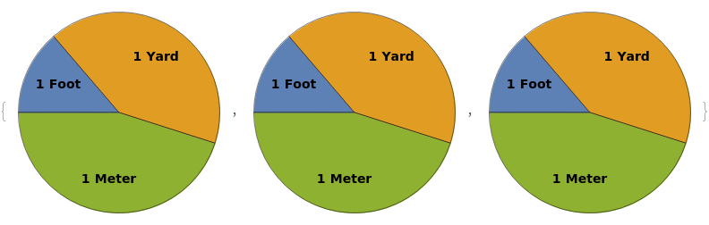
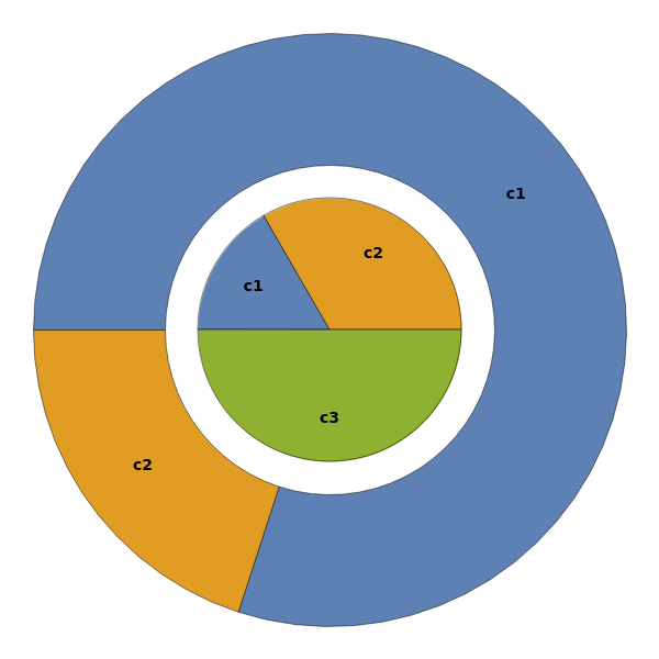
Style each group and each series of sector in each input dataset, in the format { {in1, in2,..}, {sec1,sec2,sec3,..}}:


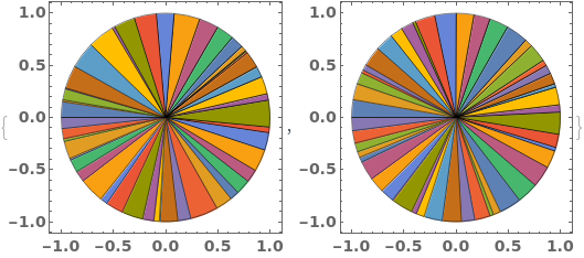
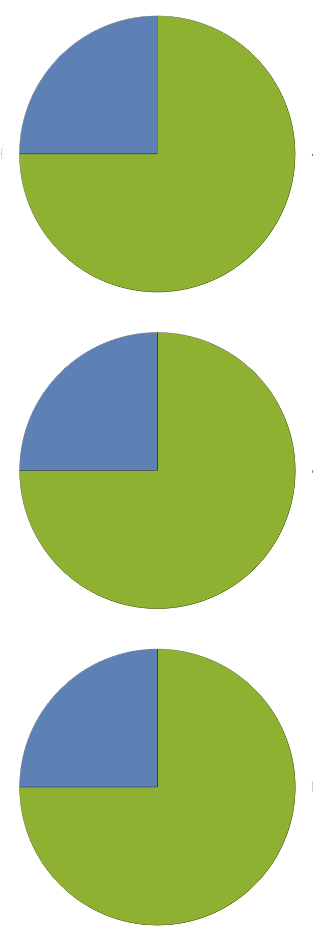
Use indexed colors for charting. Run ColorData["Charting"] to see possible index values:

ColorFunction (3)


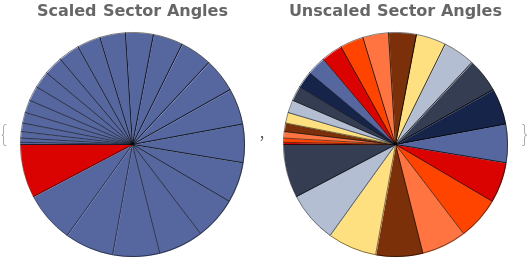
ColorFunctionScaling (1)


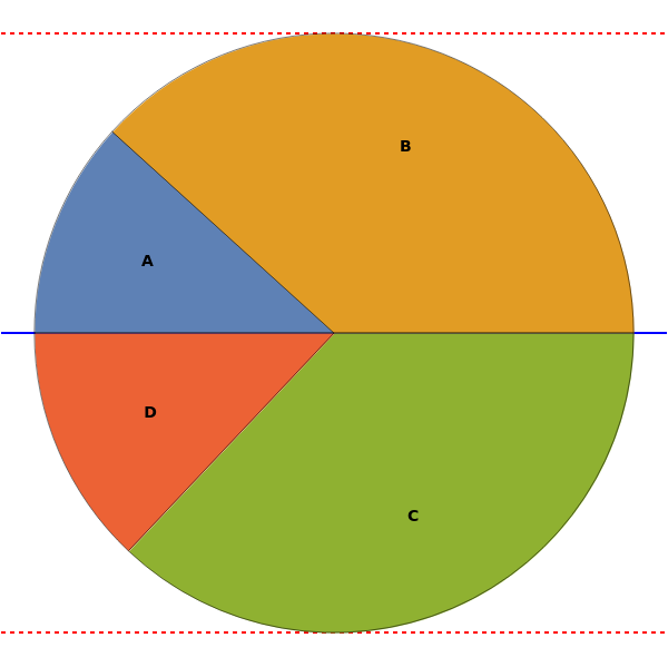
Frame (2)


FrameStyle (2)


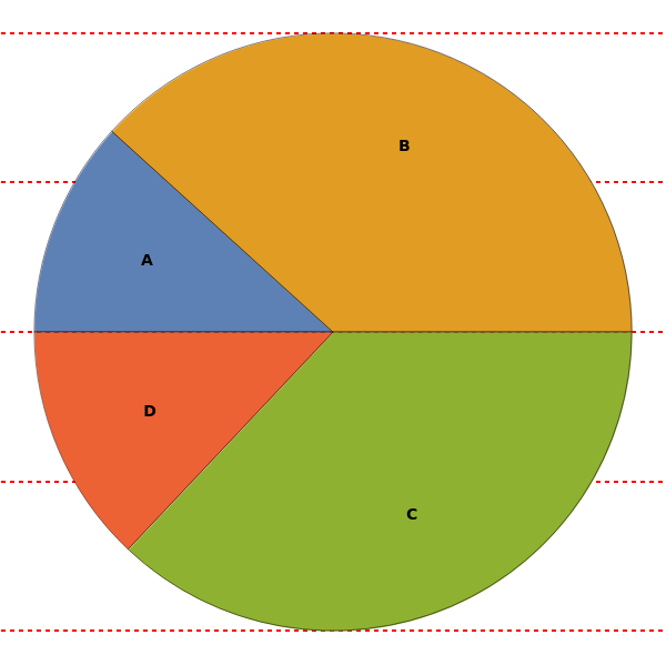
FrameTicks (1)

FrameTicksStyle (2)


GridLines (3)


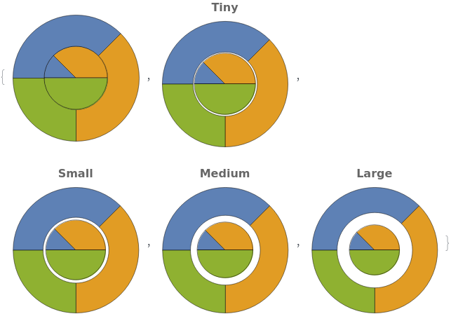
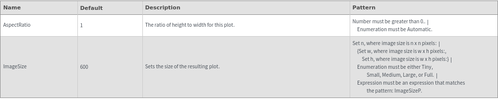
ImageSize (3)


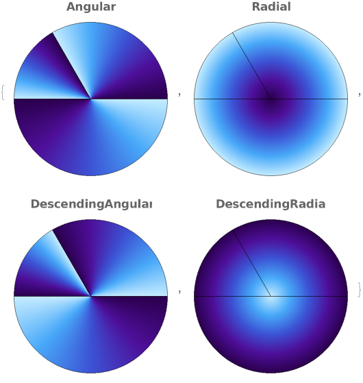
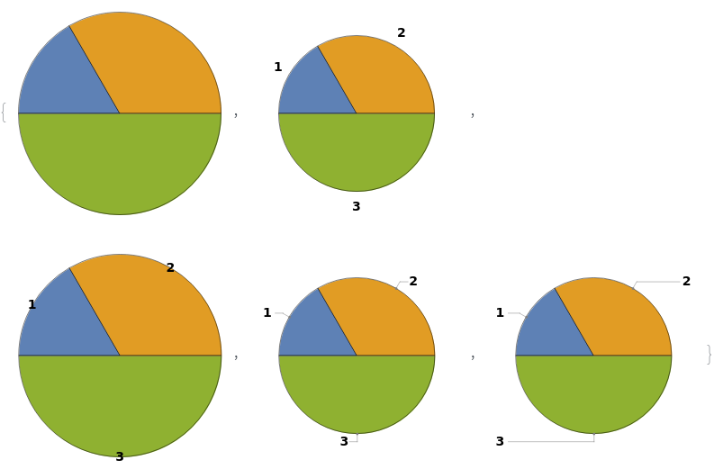
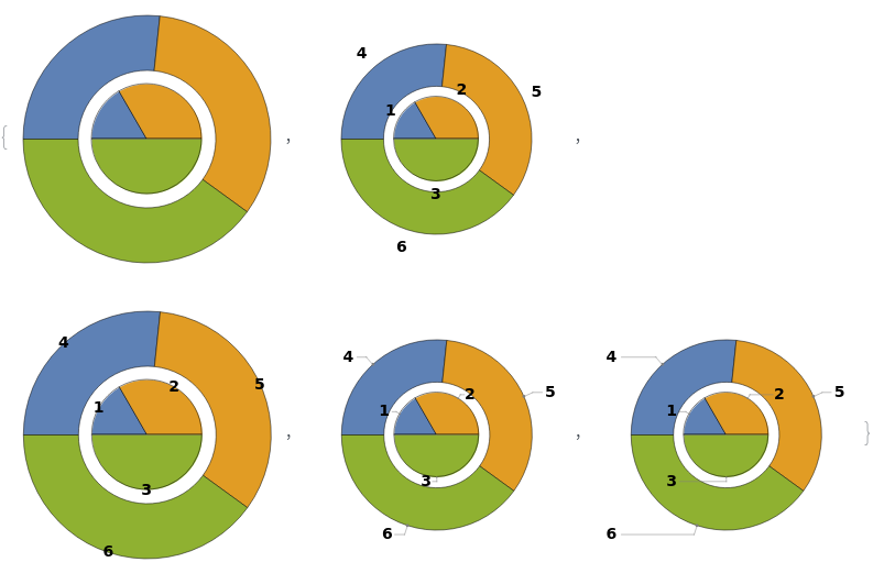
LabelingFunction (5)
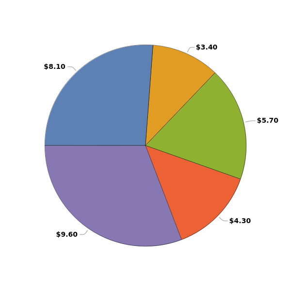
By default, each sector in the pie chart is labeled with a tooltip which shows its magnitude:

Set LabelingFunction->None to disable tooltips:

Change the LabelingFunction to a named default to get different labels:

Change the LabelingFunction to a named default to get different labels for multi-dataset plots:

Use a pure function to programatically generate labels for the elements. The function input is the individual sector magnitude: