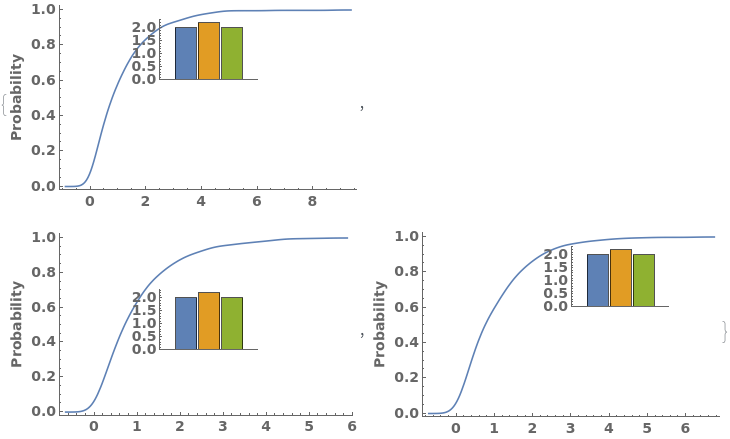
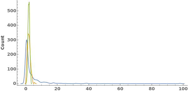
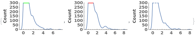
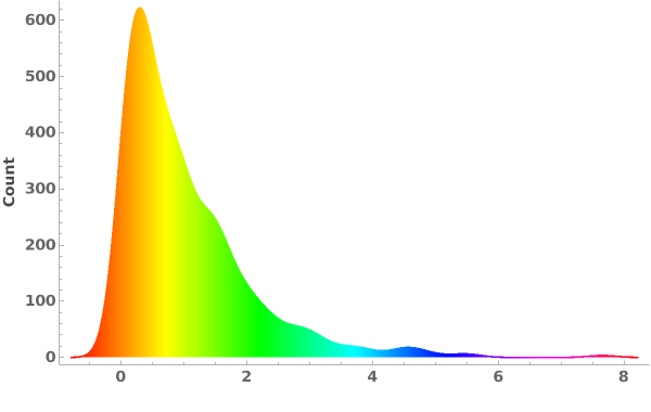
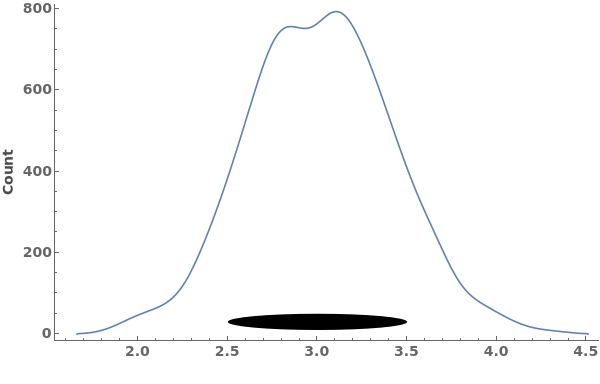
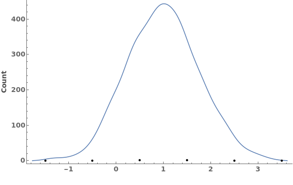
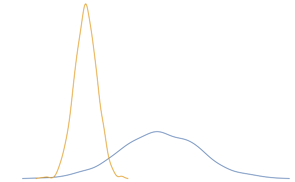
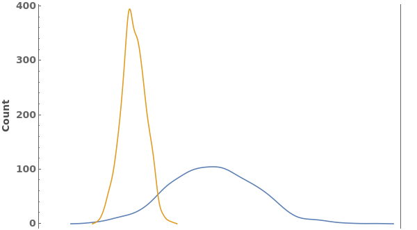
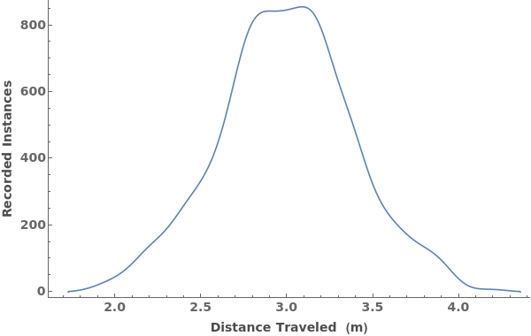
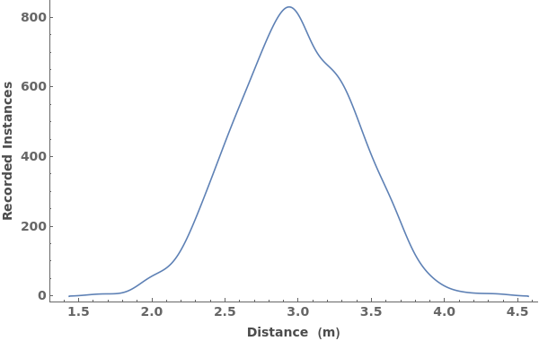
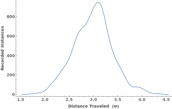
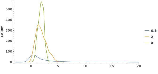
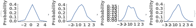
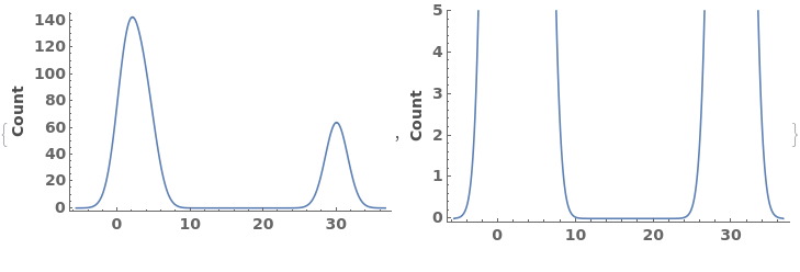
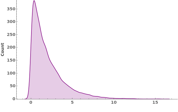
EmeraldSmoothHistogram
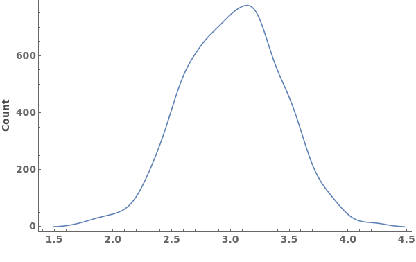
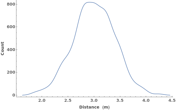
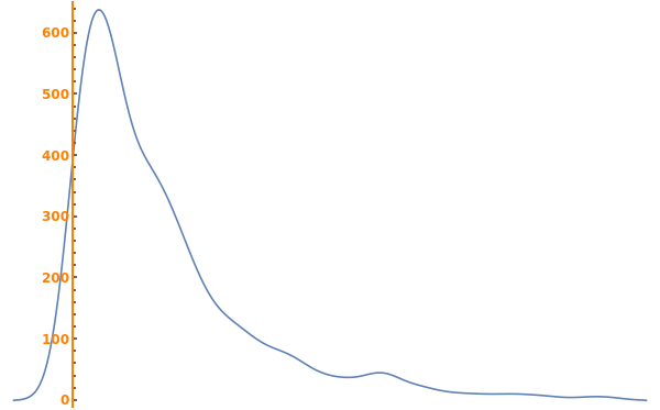
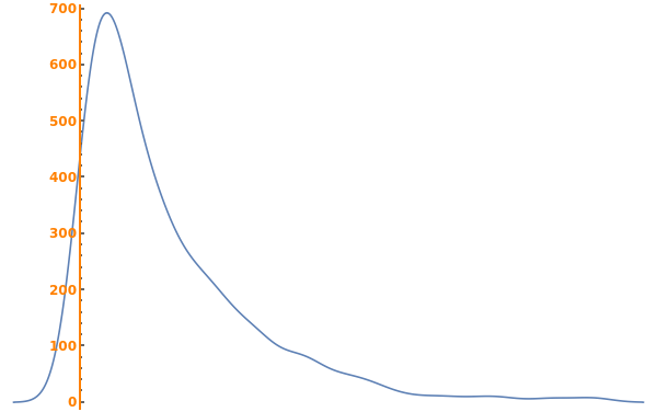
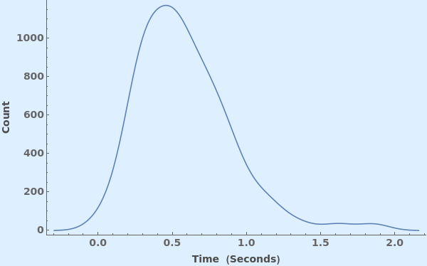
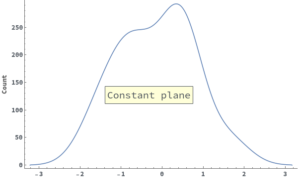
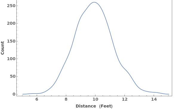
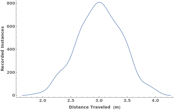
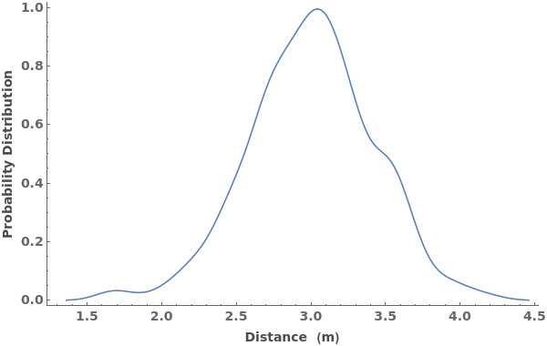
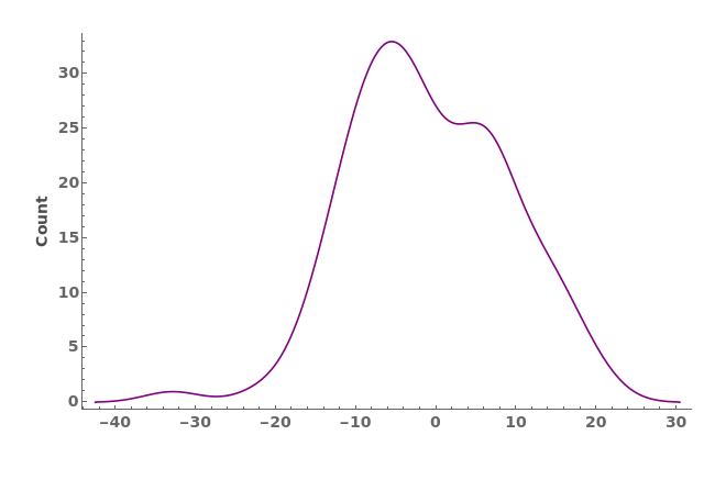
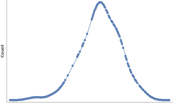
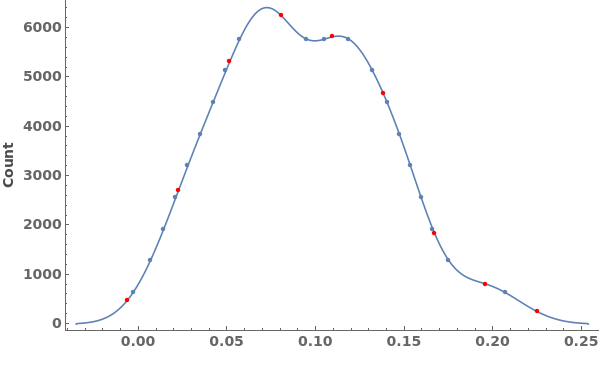
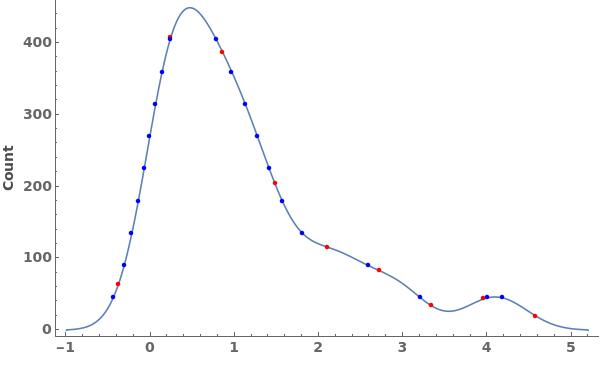
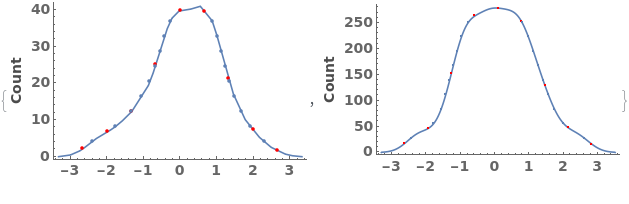
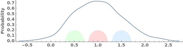
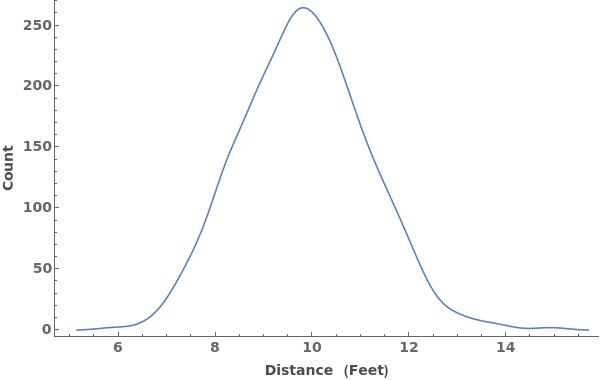
EmeraldSmoothHistogram[dataset]⟹chart
creates a SmoothHistogram from dataset.
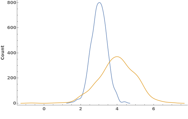
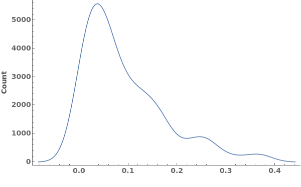
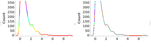
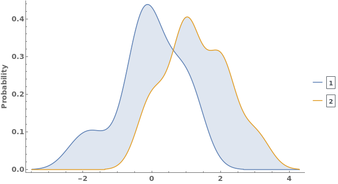
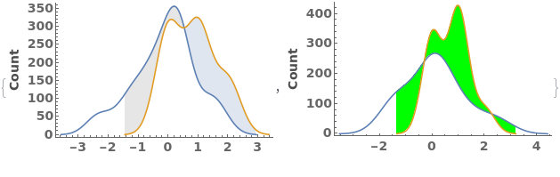
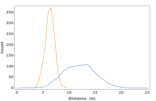
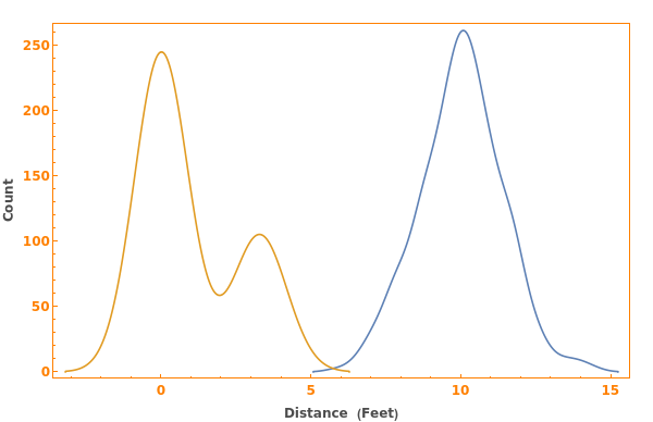
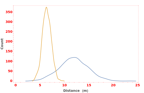
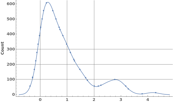
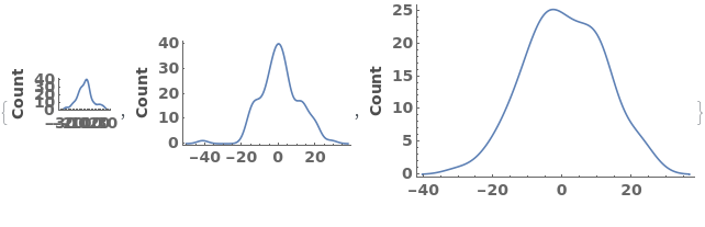
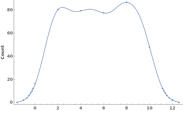
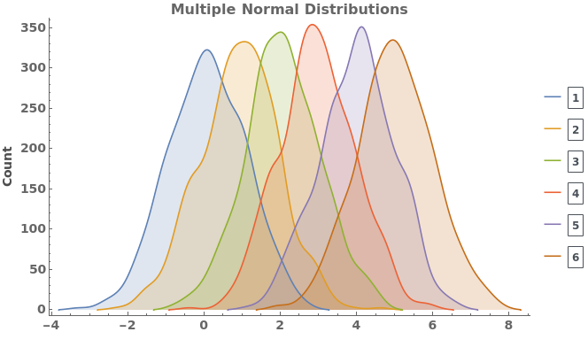
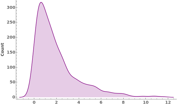
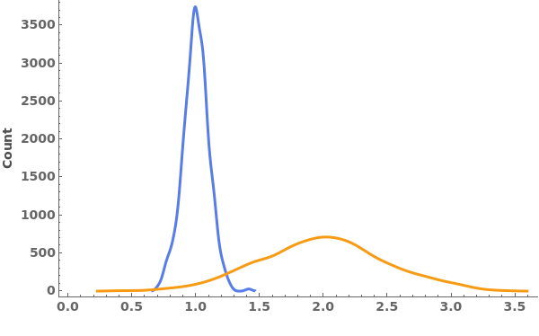
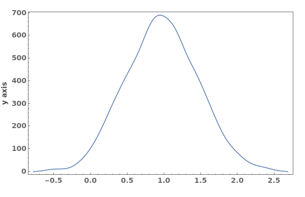
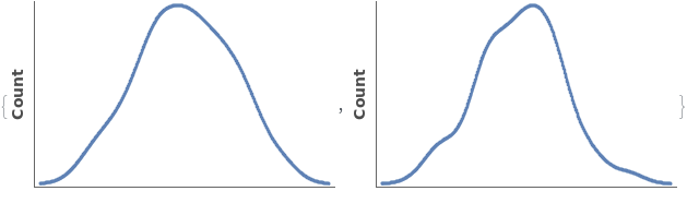
EmeraldSmoothHistogram[datasets]⟹chart
creates a SmoothHistogram displaying each input dataset in datasets.
Details
Input
Output

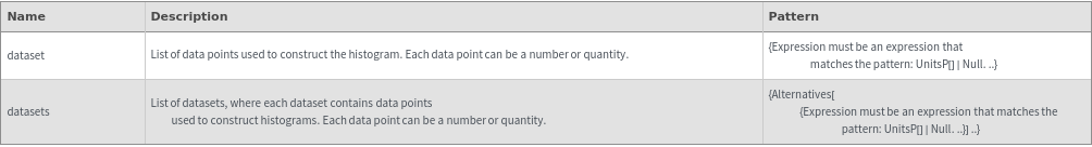
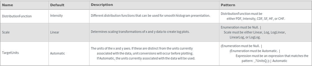
Data Specifications Options
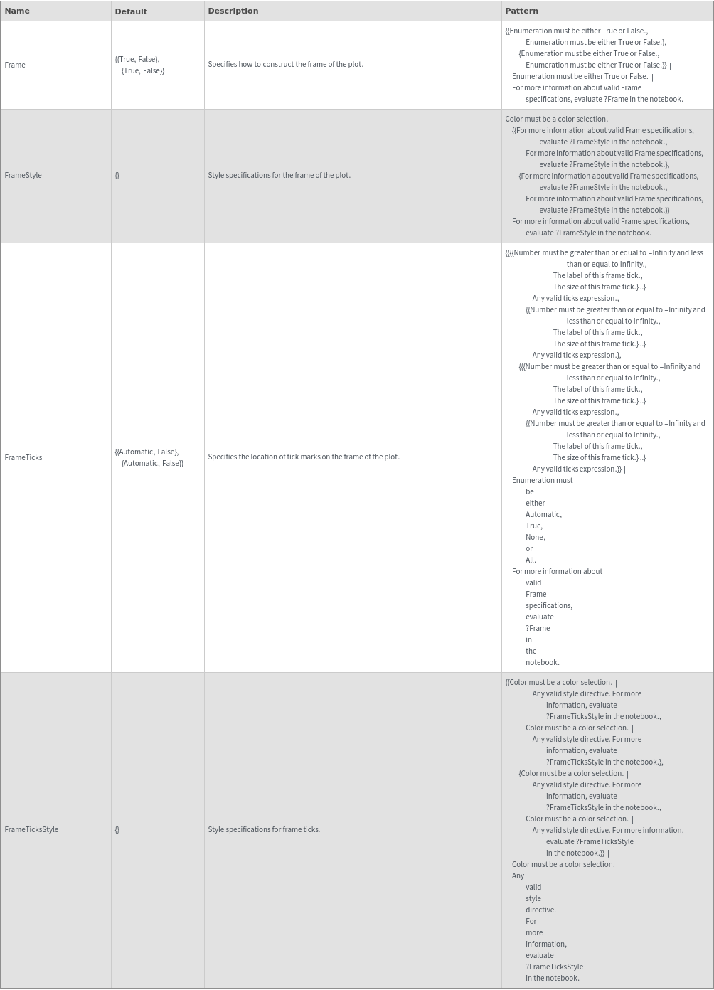
Frame Options
Grid Options
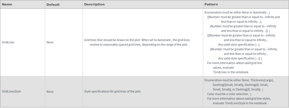
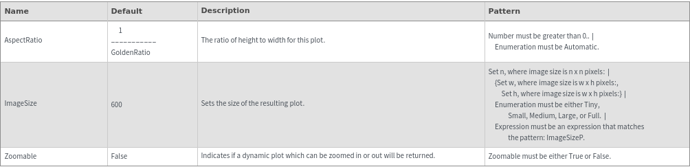
Image Format Options
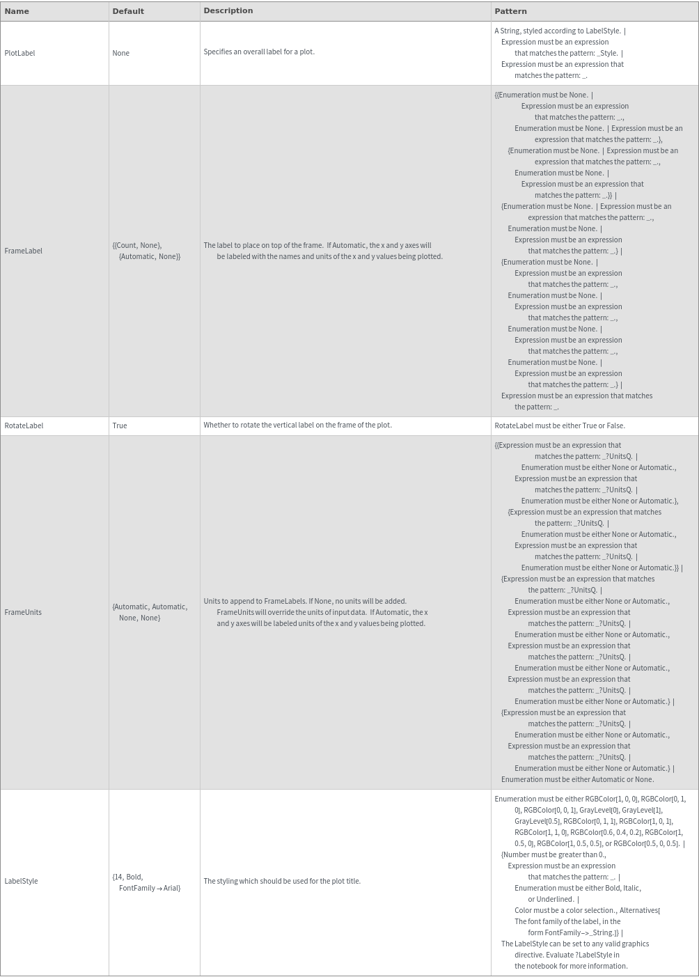
Plot Labeling Options
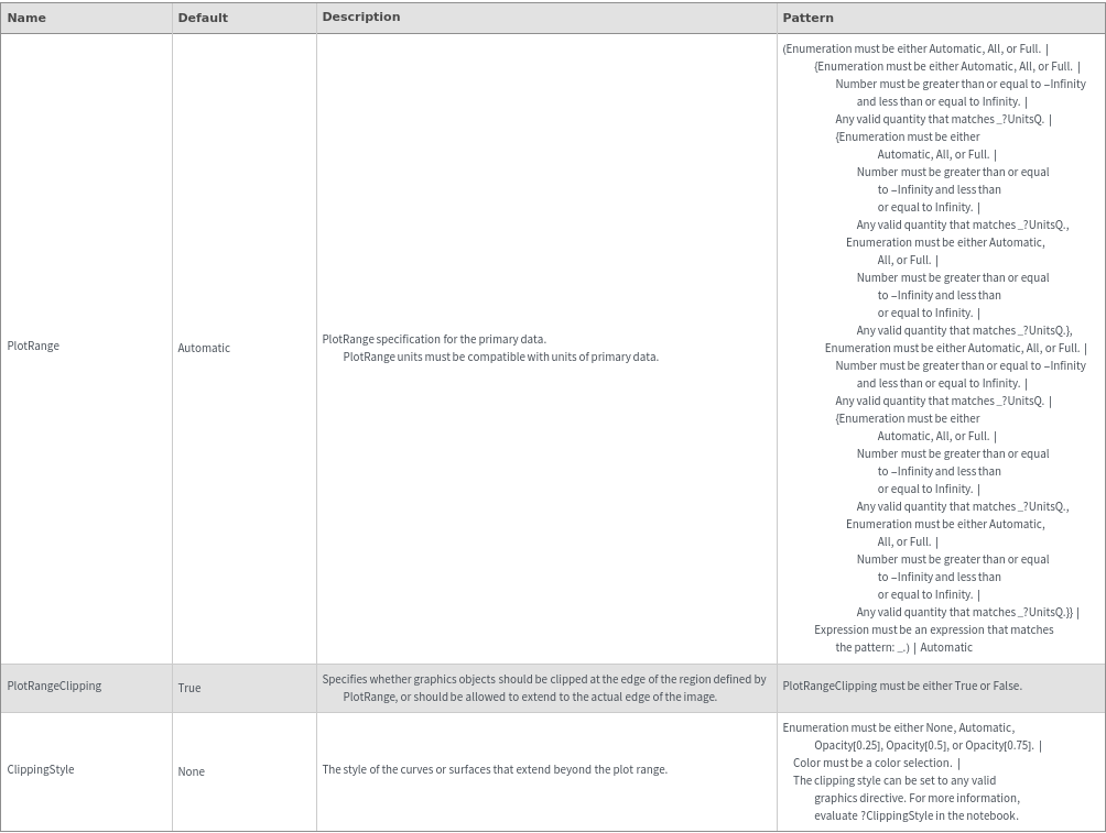
Plot Range Options
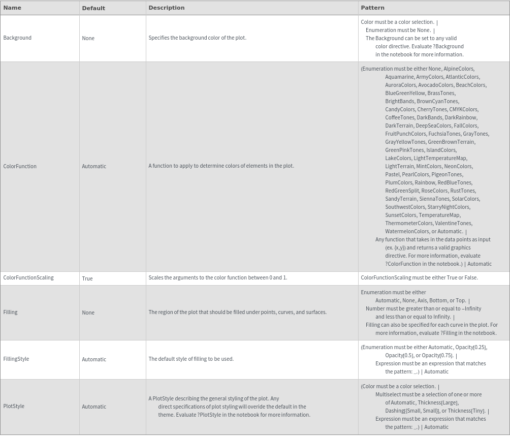
Plot Style Options
General Options